SEO Dashboard in Google Data Studio: A Complete Guide
Data storytelling ain't just about pretty graphs. It's your chance to show the value of SEO and digital marketing efforts.
Now, we're all swimming in data from Google and a bunch of other third-party sources, but don't let the good stuff slip through the cracks. SEO's a tough nut to crack, and the competition for top SERP positions is often tougher than a two-dollar steak.
When it comes to showing executives or clients why it's worth investing in SEO, the trusty SEO dashboard comes to help. Tools like Google Data Studio make it easy to create a one-stop shop for all the data and analytics you need. Let’s dive right in and discover how to turn organic search metrics into actionable insights!
What Is an SEO Dashboard?
This isn’t just a surface-level look at how many keywords you’re ranking for. SEO dashboards offer insights into the most granular details and metrics of an SEO approach, helping you better understand the reality of your link-building strategies, technical SEO specs, session averages, and more.
SEO Dashboard Benefits
If you’re well-versed in Google Analytics, Moz, and other SEO tools, you may not think you need a separate SEO reporting dashboard. After all, many of these tools are free and offer the same flexibility; what makes an SEO dashboard any different? These four benefits will spell it out for you.
Single Source of Information
The most obvious benefit of an SEO dashboard is the convenience of your data. You won’t have to search for it anymore as it will all be conveniently located in an easy-to-consume interface.
Efficient SEO Reports
Relying on free SEO tools might work for you, but compiling an SEO report from all of that data is time-consuming. It can take hours to pull data from each resource and even longer to root out duplicate data sets tracked by multiple SEO tools. An SEO dashboard enables you to pull information from multiple sources in one place to deliver faster reports.
Easily Digestible Visual Charts
Don’t give your decision-makers a long list of numbers to scratch their heads at. SEO dashboards provide thorough and detailed informational charts and graphics to clearly communicate your SEO performance.
Detailed Competitor Insights
SEO is all about how you rank compared to the competition. Therefore, no SEO strategy is complete without in-depth competitor analysis insights. Your SEO dashboard provides regular (daily, monthly, weekly, you name it) rank changes and compares those rankings to see exactly how well you stack up to the competition.
Corresponding content:
- 25 Best Marketing Dashboard Templates for Every Marketing Use Case. Build an All-Round Marketing Analytics.
- How to Ensure that You’re Creating High-Converting Content with a Content Marketing Dashboard.
What is Google Data Studio?
Google Data Studio is a free reporting tool that helps digital marketers create custom dashboards for SEO and marketing campaigns. To get started with data studio, simply create a free account .
What is Data Storytelling?
Data storytelling is the ability to communicate insights from datasets using visuals, narratives, and reports. In SEO, data storytelling should clearly communicate improved search visibility for a website.
The common qualities of great data storytelling include:
- Accurate, comprehensive data
- Relevant, engaging visuals
- Clear, compelling narratives that speak to a target audience
- Reporting and metrics that show meaningful impact and results
Digital marketers that create SEO dashboards in Google Data Studio should aim to meet the above standards of data storytelling.
Creating effective data narratives has all sorts of benefits to the growth of an SEO agency or SEO provider, like earning new clients, improving client retention, proving value and revenue growth, and leveling up SEO reporting to provide more strategic insights.
What KPIs Should Be Included in my SEO Dashboard?
When it comes to proving SEO success, there are a variety of metrics that can show improved SEO performance. Although the ultimate goal of SEO is to drive organic clicks to a website, clicks are not the only measurement of improved search visibility.
Depending on the services or deliverables you offer, here are some key performance indicators that you will want to include on your SEO dashboard.
Impressions
Impressions are the first early signal of successful SEO. An impression happens any time a user sees your result in the SERPs, even if they don’t click on it. Lots of impressions for the primary keyword and keyword variations you’re targeting is a good sign that Google crawlers understand your content and know when to promote it.
Keywords
The more keywords that your web pages rank for, the more often your content gets in front of the eyes of potential customers. Long-form, comprehensive content is more likely to be promoted for multiple keyword phrases, so a high number of organic keyword rankings shows your web pages are accomplishing even more work for you.
Also, some keywords are more valuable than others. Certain keywords have higher search volume, less competition, or high CPCs, which usually represent qualified traffic with strong conversion potential. Being able to show the exact keywords that are driving users to a website can be extremely important for showing value.
Average Position
This is the average ranking position across all of the keywords an individual page ranks for or an entire site ranks for. A lower average position is a strong sign that Google sees your content as higher-quality, more relevant, or more authoritative than competitors, and thus is promoting it closer to the top of search results.
Total Clicks
The ultimate goal of SEO is to earn real clicks to your website, but this often comes later, after all of the above metrics show improvements. It may be a few weeks or even months before your web pages start generating organic clicks, but you will absolutely want to be tracking them in your dashboards and reporting.
Click-Through-Rate (CTR)
CTR is calculated by dividing the total clicks for a web page by its total impressions. It is represented as a percentage. Web pages tend toward higher click-through rates the higher their SERP position, and strong click through rates can provide insights about meta tags like page titles, url paths, and meta descriptions.
Country
For brands with a global reach, it is extremely valuable to know where your organic visitors come from. This information can help you track the impact of geo-targeted optimizations like hreflang tags, language specific landing pages, and more. For any SEO provider or digital marketer that is providing international SEO services or has location-based goals, this KPI should definitely be included in your dashboard reporting.
Device Type
Searchers may use a desktop, mobile, or tablet device when arriving at a website from organic search. Tracking device type can provide key insights on what types of design elements or CTAs will be most effective in driving conversions. Understanding whether conversions on a website come from desktop, mobile, or tablet can also help with making strategic UI/UX decisions, and can be adequately displayed in Google Data Studio with both GSC and GA datasets connected.
Benefits of Google Data Studio for Data Storytelling
Beyond being free, Google Data Studio’s ease of use and user-friendly interface makes it easy for anyone to create and customize their SEO dashboards and reports.
Depending on your SEO services or the goals of your campaigns, you can create reports that are specifically tailored to your target audience. Google Data Studio allows users to:
- Combine data from various sources
- Visualize any data combination
- Unlimited customization
- Easily present more complex themes or metrics
- Save time with automated report building and data compilation
- Help those with less understanding of SEO data gain strategic insights
- Create custom reporting and dashboards that include your own logo and branding
Challenges of Using Google Data Studio
The historical data deficit
So you're plugged into Data Studio, and it's giving you the overview of your keyword ranks, traffic, impressions – the works.
But what's missing? Oh, just a little thing called historical data.
With no backroom for storage (Google Sheets, at the very least), Data Studio is always stuck in the present. It's like trying to read a book with all the previous chapters ripped out. How can you assess your performance if you don't know what you've done in the past? How do you learn, adapt, and evolve your SEO efforts? Without that backstory, you're flying blindly into the SEO abyss.
Inconsistent data across multiple platforms
Now, connecting a single platform to Data Studio might seem as easy as pie. But try connecting several, and you get confused in disparate metrics really quickly.
Your data starts to look like it's talking in tongues. Google Analytics shows you one thing, and Search Console shows another. Why do keyword positions vary from platform to platform?
Different platforms use different algorithms and scraping bots to gather keyword rankings and organic traffic data. To solve this issue, you have to normalize data before it gets to Google Data Studio, which is basically impossible if you connect platforms directly to it. All the normalization processes usually take place in data storage with SQL queries or at least spreadsheet formulas. And this returns you to the previous challenge — the lack of data storage.
Without consistent data, you’re looking at dull numbers that will only confuse you.
DIY Data Studio dashboards aren’t scalable
With each new platform connected to Data Studio, you're not just adding more work – you're multiplying it. You've got to come up with new charts, remap data, and align naming conventions all over again.
And then, after weeks of toiling away, there's still no guarantee you’re looking at the right numbers. A reliable SEO dashboard requires thorough review after populating it with new data. And that’s a labor-intensive task even for experienced analysts, let alone SEO specialists.
Getting Started with Google Data Studio
After you create your free account, you can start creating SEO dashboards and reports within the Google Data Studio platform. To get familiar with using the platform, make sure you understand the basics.
Google Data Studio Connectors
Google Data Studio has nearly 500 different “connectors,” that you can use to import datasets for your website. These connectors include Google platforms as well as third-party platforms, referred to in Google Data Studio as “Partner Connectors.” Some of the most popular include:
- Google Search Console
- Google Analytics
- Google Ads
- Ahrefs Site Audit
- Amazon RedShift
- Cloud Spanner
- eBay
- YouTube Analytics
- And more!
For SEO dashboards specifically, you will want to make sure the connectors you select include datasets for organic search, including keyword rankings, organic clicks, impressions, and other key SEO metrics.
You can also upload your own data set via GoogleSheets or the File Upload connector. For anyone who has specific data points that they want to highlight, or if you want to remove particular parts of a dataset from one of the other connectors, I suggest manipulating the data within a spreadsheet and then connecting to Google Data Studio from there.
Starting a Project
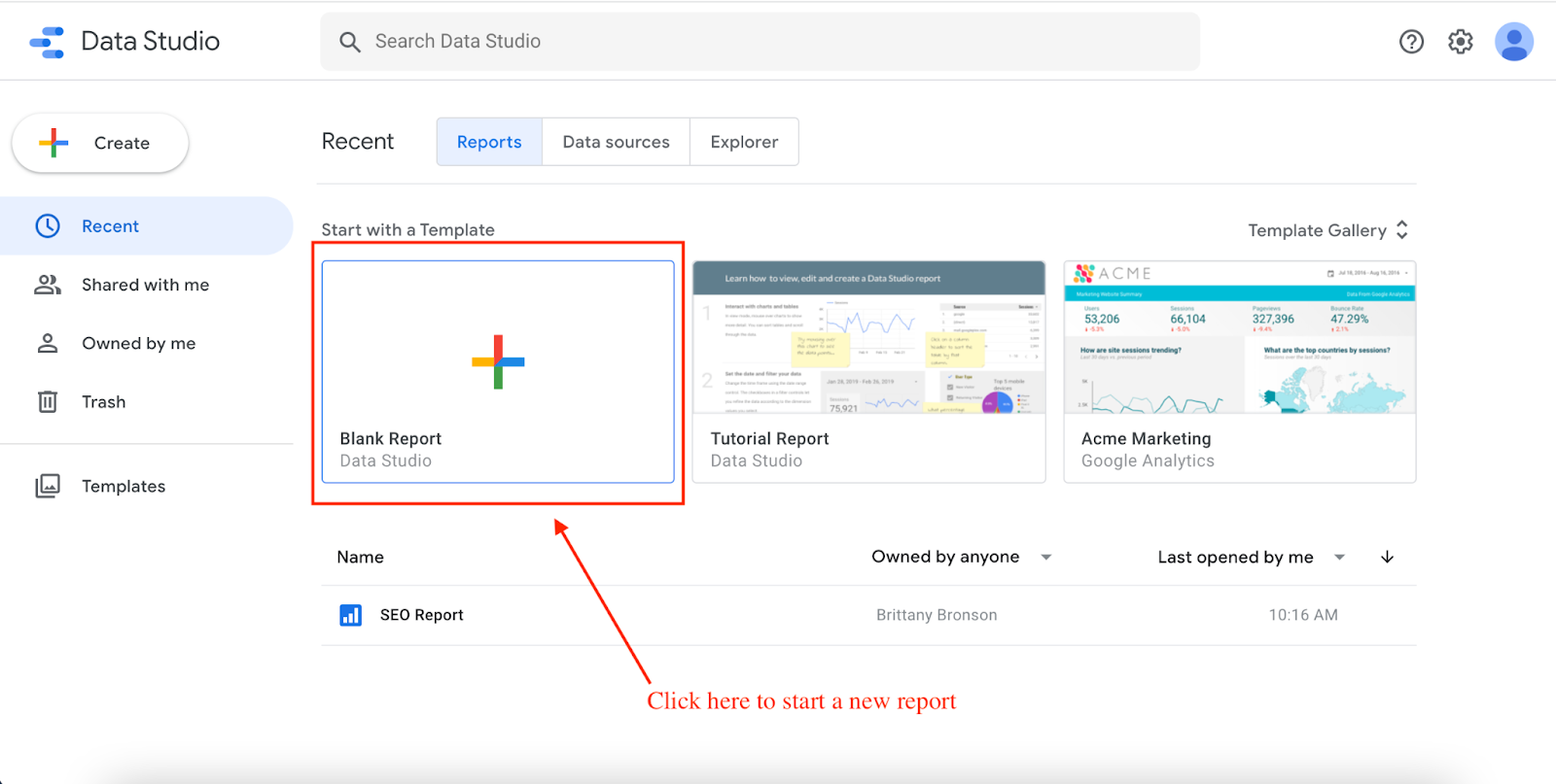
After you have made your Google Data Studio account, click “Blank Report,” to get started.
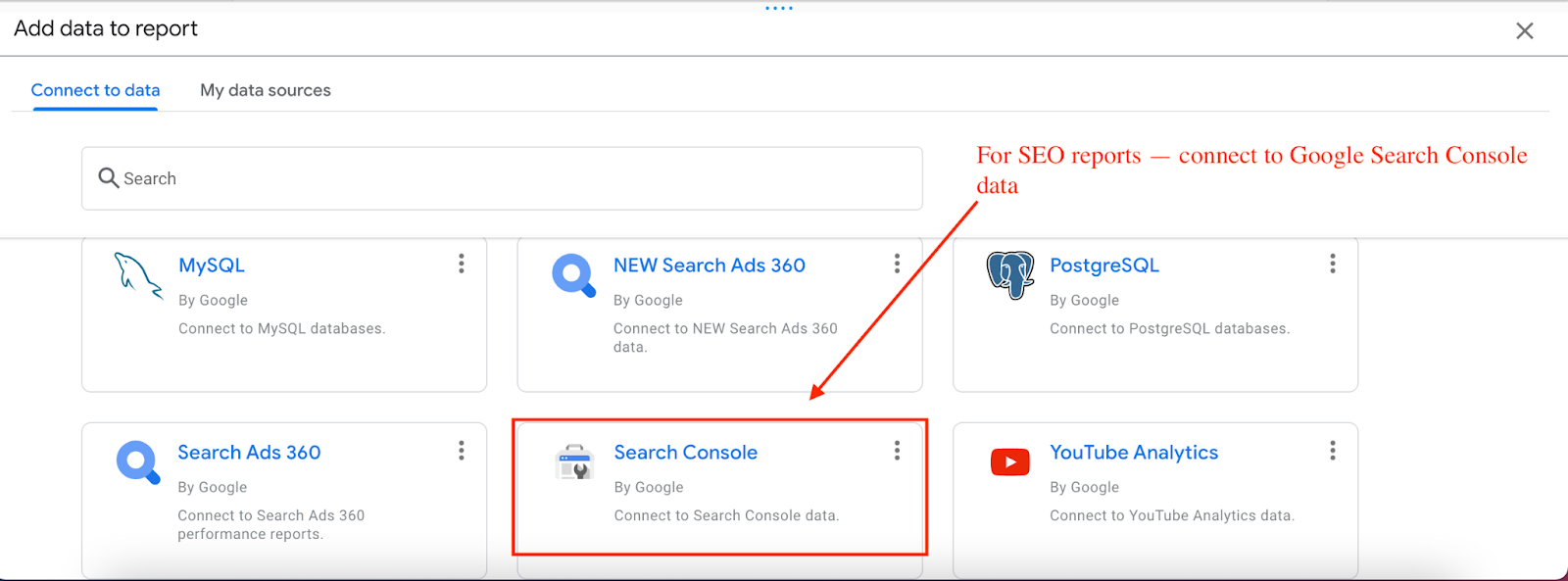
Then, you will need to select your preferred connector. For the purpose of this article, I will simply connect data from Google Search Console. Because Google has the most complete and comprehensive SEO dataset for websites, this is one of the most reliable and up-to-date data sources to build SEO dashboards.
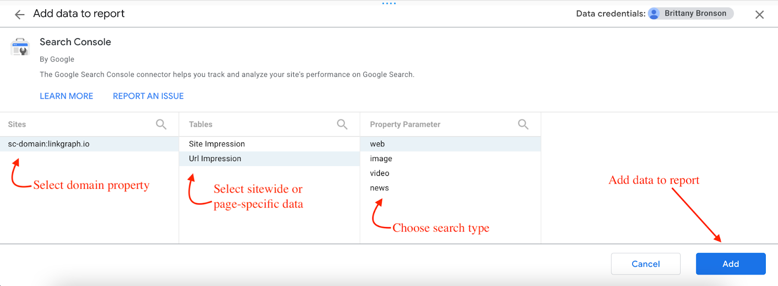
You will then be prompted to select specific parameters for the report including domain property, site impressions or url impressions, and the search type you want to see data for, whether web, image, video, or news.
You will then be directed to the blank report page where you can begin selecting and adding custom data visualizations.
If you want to add a second data source, you can do so through the tab Resource → Manage Added Data Sources. This is also the menu where you can make any changes to your parameters.
Some SEO providers may want to also combine Google Analytics data to show what users are doing on a website after they arrive from organic search.
But for the purpose of SEO reporting and this guide specifically, I will be focused on creating reports strictly from Google Search Console data.
Dimensions vs. Metrics
Dimensions are shown in green and represent categories within your dataset. Metrics measure one of the characteristics of a dimension, and they are designated in blue.
For data visualizations, you will need to select at least one dimension and one metric. For example, total impressions by keyword query, or url clicks by country.
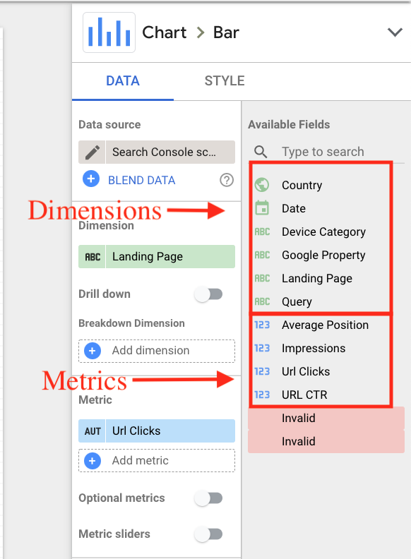
Your metrics and dimensions will be determined by the dataset from the Google connector. For example, connecting Google Analytics would add metrics like sessions, bounce rate, and Pages/Session into your list.
After you add a connector, you should see all available dimensions and metrics listed under the “Available Fields.” If you are working from a spreadsheet, you need to make sure that you do not have empty columns or rows and that your dimensions and metrics are clearly labeled and organized. Otherwise, the data visualizations will not populate correctly.
How to Create An SEO Dashboard
How you choose to create your dashboard will depend on your target audience, the products or services you provide, and whether you offer sitewide SEO strategy or simply optimized specific landing pages. If you set specific goals at the outset of your SEO campaign, your dashboard should tell a clear story of meeting those goals.
There are a range of data visualizations available within Google Data Studio. Although we won’t be able to cover all of them here in this guide, below are some of the key components of the tool that will help SEOs develop comprehensive reports and dashboards.
Add a Table
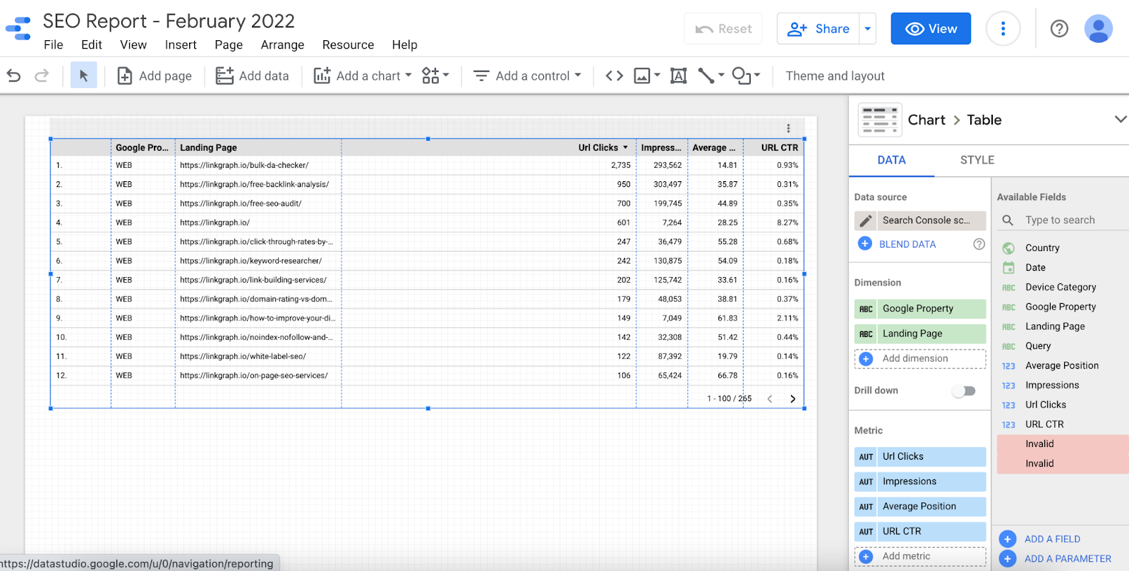
Adding a table with the most important SEO KPIs – impressions, clicks, average position, and CTR, is the best way to provide a high-level overview of SEO performance. If you provided sitewide SEO optimizations, you can select “Landing Page” as your dimension in order to show the metrics for each url within a domain property.
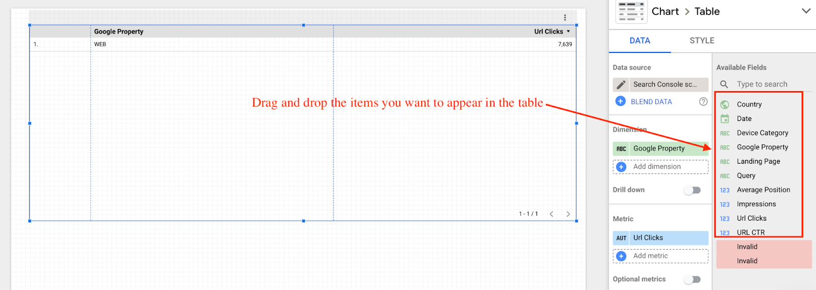
To add a table, navigate to Insert → Table.
Then, use the available fields on the right hand menu to drag and drop the dimension and metrics you want to chart on the table.
In the below report, I selected all four metrics – impressions, clicks, average positions, and CTR – and the “Landing Page” dimension. This creates a clear picture of the total performance metrics for each landing page on an entire website.
For SEOs, adding a keyword table can also be beneficial for users to see the exact keywords that are driving clicks. Most SEO campaigns have specific keyword goals in mind, so if one of your client’s campaign goals was to improve performance for specific keywords, simply change the dimension to “Query,” to chart metrics for individual keywords.
Add a Time Series Chart
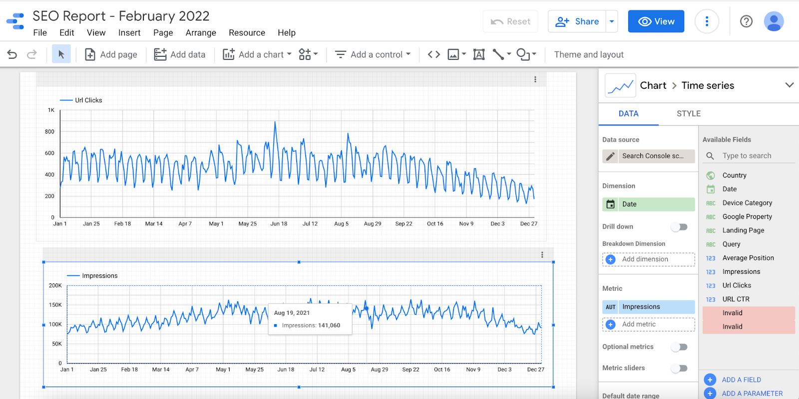
If you want to see how your KPIs have changed over time (e.g. before or after an SEO campaign), add a time series chart (or line graph) to your SEO report.
This is particularly useful if you have a clear start and end date for your campaign, allowing you to tell the story of improved performance as the result of your optimizations and strategic approach. The reality is, SEO optimizations often take a few months to take effect, so providing monthly or quarterly reporting can often tell a strong story of improved SEO performance.
Just like with a table, choose the item from the Insert menu and drag and drop the dimensions and metrics that you want to chart. The below image shows url clicks and impressions to a site property for a designated time period.
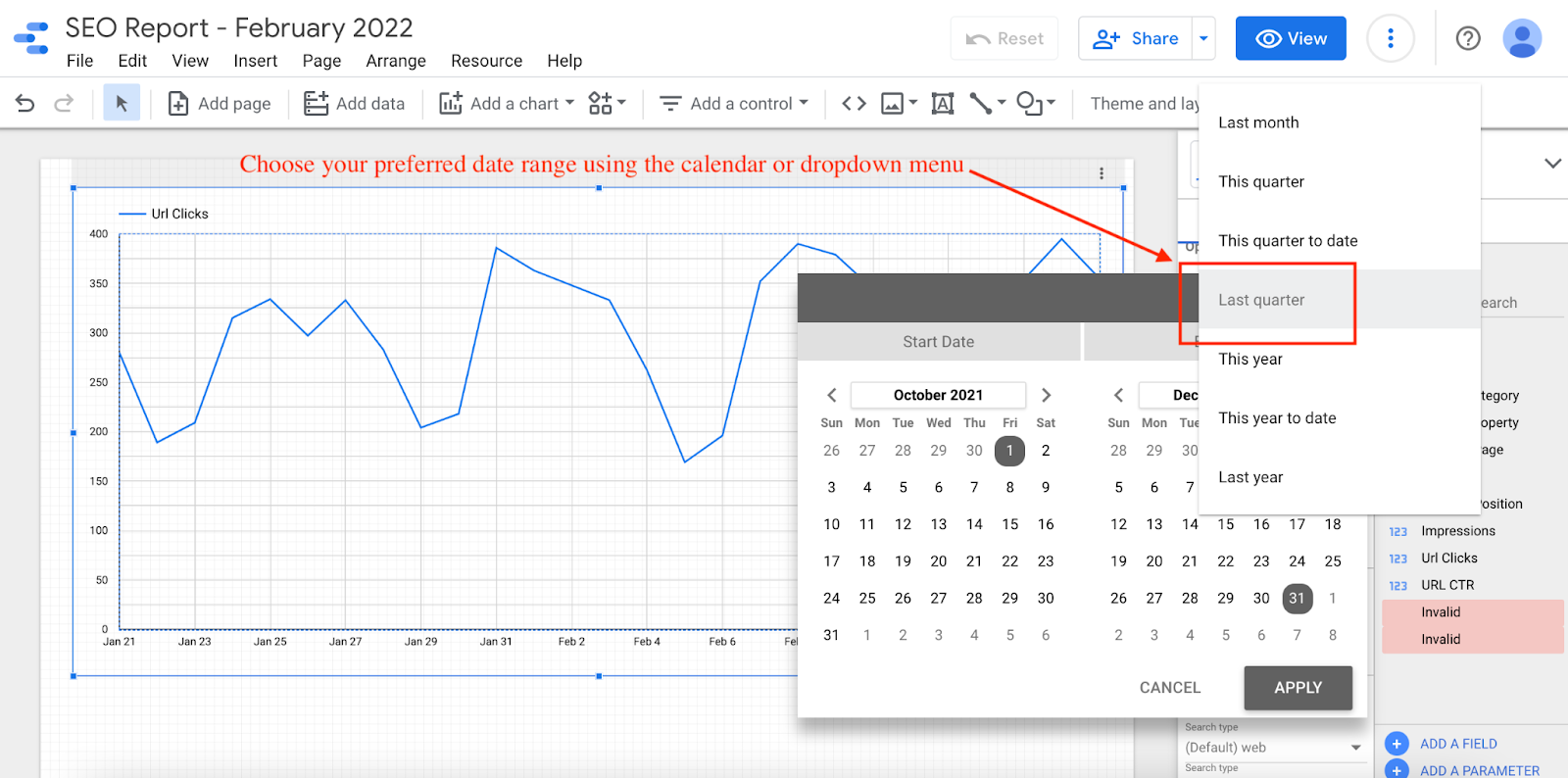
Google Data Studio will default to the last 28 days, but you can set a customized date range as well by scrolling to the Default Date Range on the right side menu.
In general, try to choose a date range before and after particular SEO actions – whether on-page optimization, link building campaigns, site speed improvements, or others.
This can help you clearly tell the story of whether that action had a positive or negative impact on SEO performance overall.
Add a Bar Chart
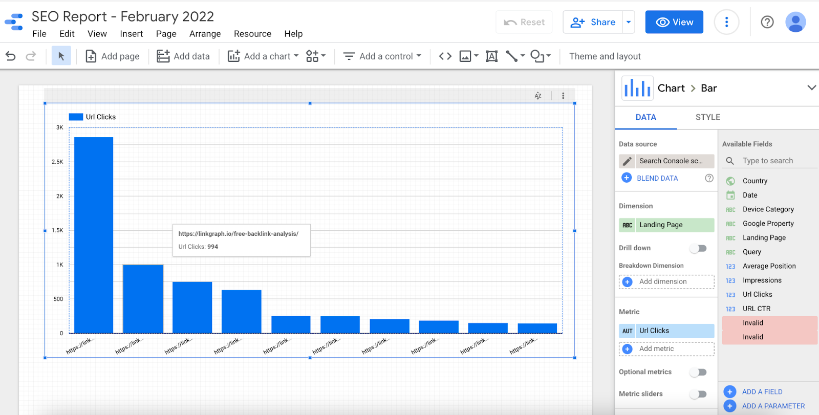
A bar chart is another useful way to visualize SEO data. If you want to compare top pages, for example, a bar chart can help you see which are the best performing in organic search for a website.
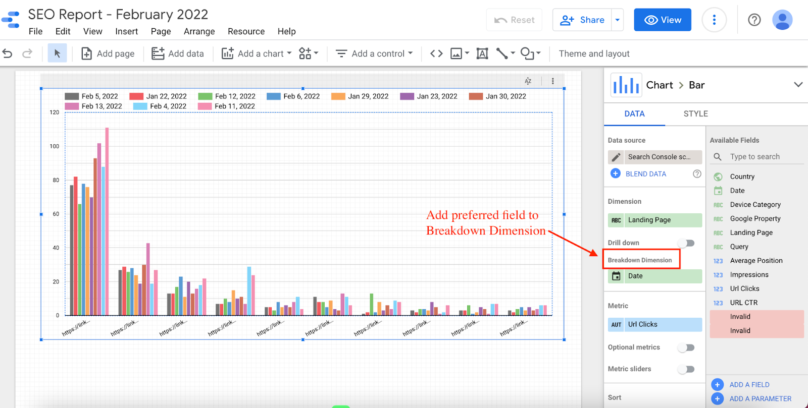
To get even more granular with the storytelling, users can leverage additional features of Google Data Studio like Breakdown Dimension to help tell a more nuanced data story.
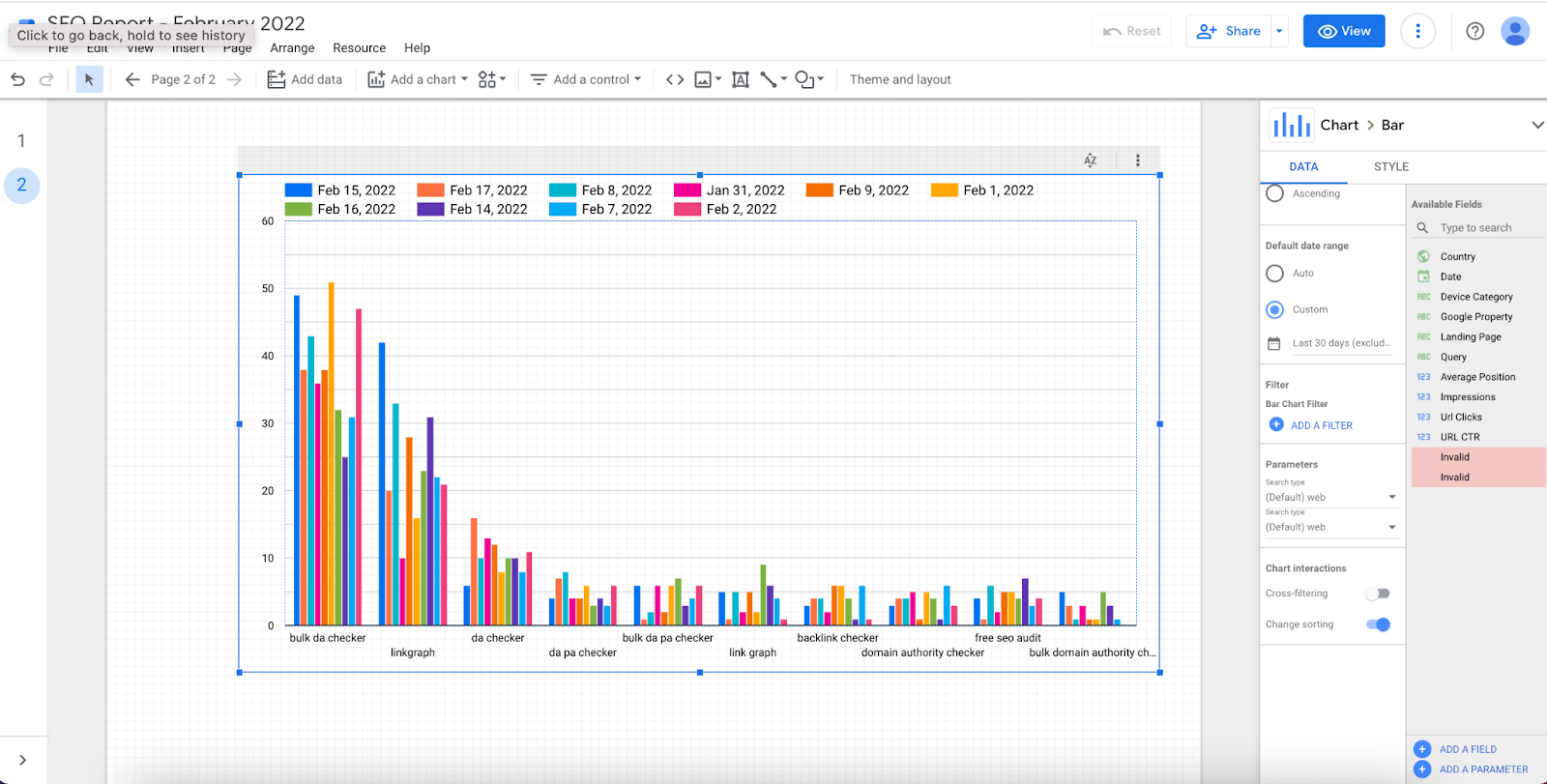
For example in the below chart, we can see how organic clicks to top landing pages on this website increased over the course of a year. If there were specific pages that your built backlinks or provided on-page optimizations for, a bar chart is a clear way to show how your SEO services made an impact.
Similarly, SEOs can create a similar chart with the Query dimension, rather than landing-page, data. This can help show the amount of clicks earned from individual keywords over the course of a specific time period.
Add a Geo Chart
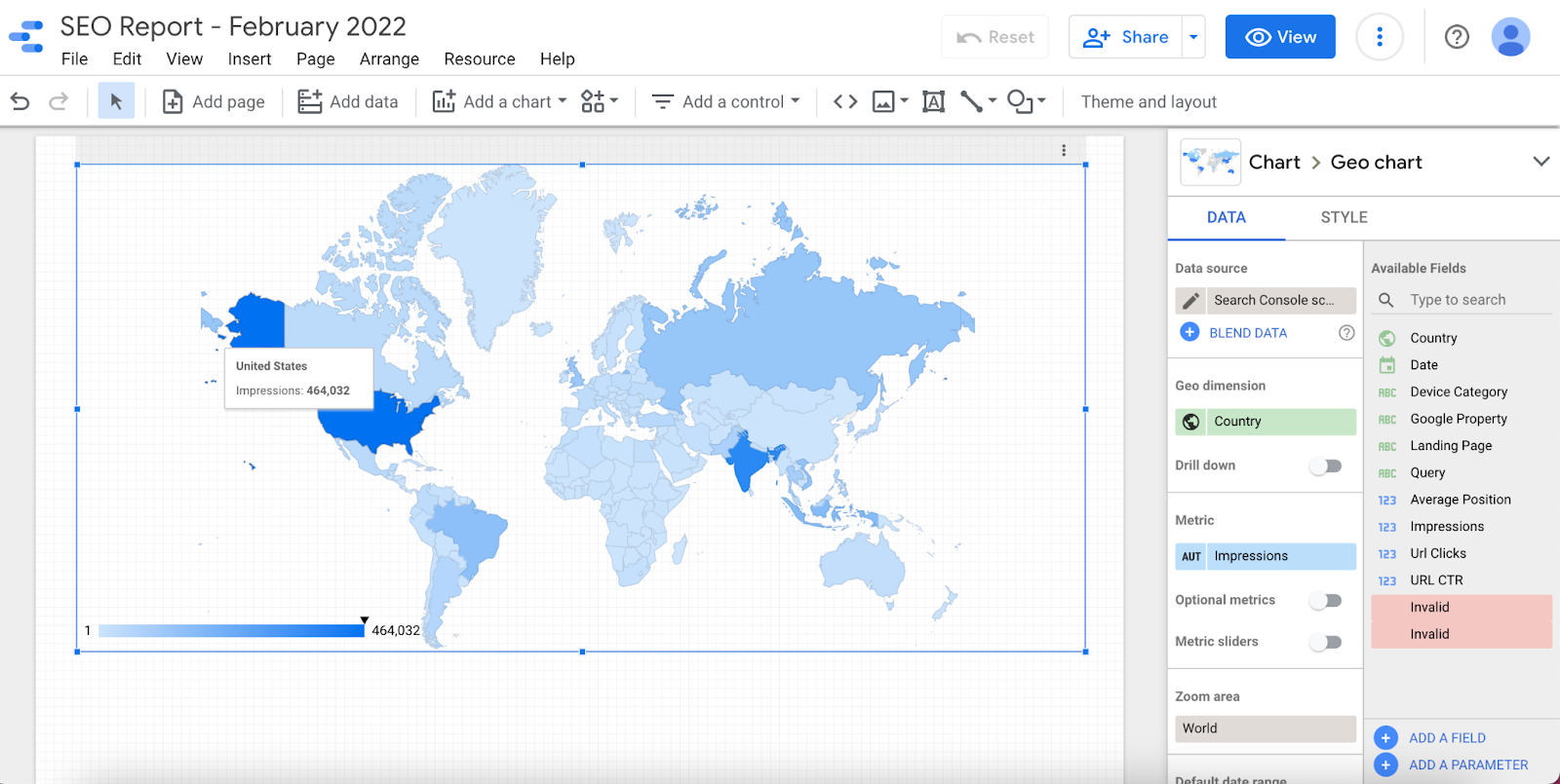
A geo chart can help you see the specific areas of the world where your clicks, impressions, etc. come from.If a part of your SEO services or deliverables are improving search visibility for specific geographic locations, then a geo chart is essential to proving whether you were successful in accomplishing that goal.
Navigate to Insert → Geo Chart to easily add this data visualization to your dashboard.
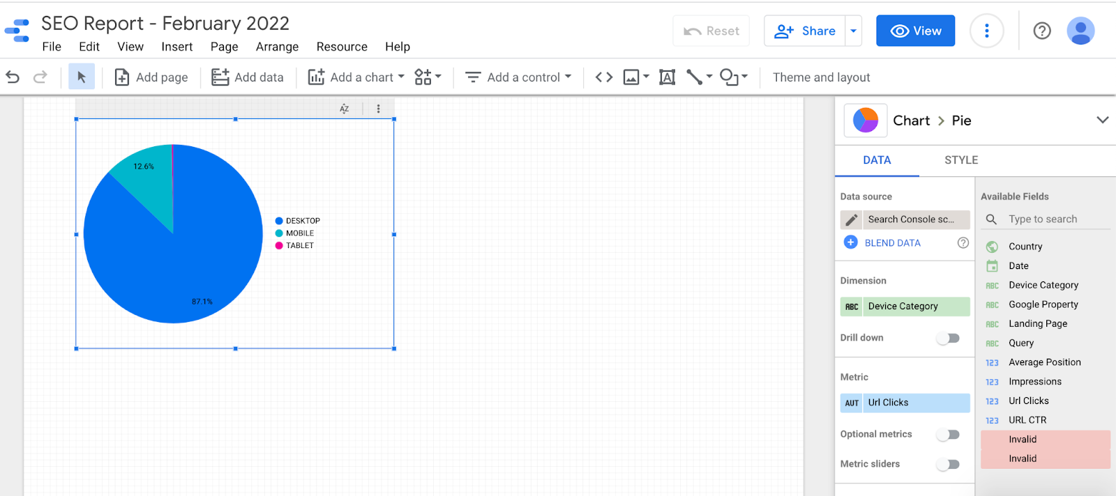
Add a Device-Type Pie Chart
If knowing the type of device your organic visitors are using is helpful to your SEO strategy, add a pie chart in the same way as the above data representations.
Navigate to Insert → Pie Chart, then drag and drop your desired field.
Why track devices in SEO reports? Well, users behave differently on desktops than they do on mobile devices or tablets.
For example, if a website isn’t mobile-friendly but the majority of its organic visitors are arriving from mobile, that can be a data story that convinces the site owner that they need site speed or mobile optimization services.
Data storytelling cannot only help you show clients that you did your job well, it is also an important part of explaining to potential clients why they need the services you offer.
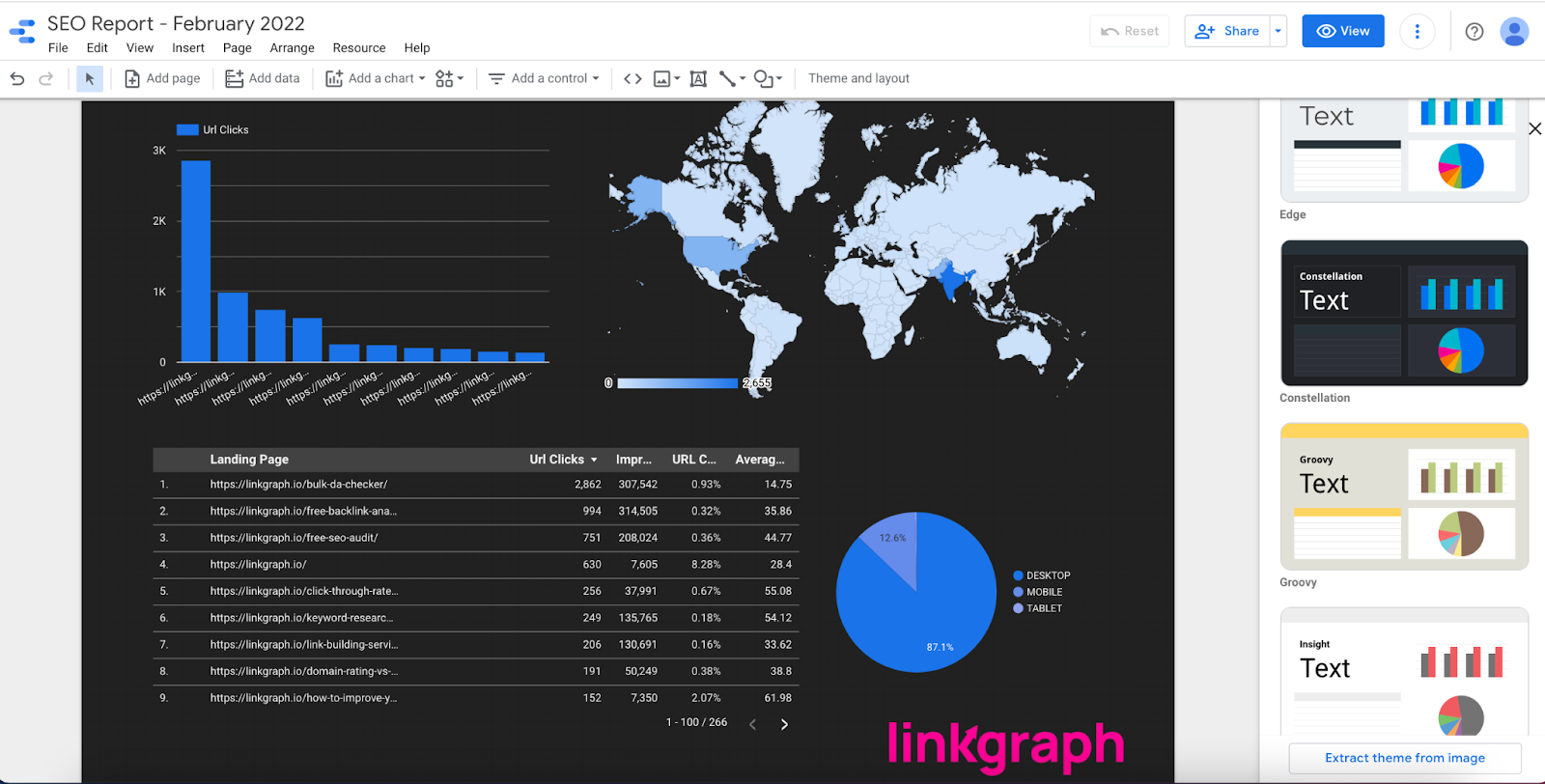
Mix & Match, Change Themes, Etc.
In addition to unique charts and data combinations, you can also customize the themes, colors, and text that you include on the report, or even add your agency or SEO business logo to bring your report an even more professional look.
Remember, the data combinations and visualizations you add to your report will depend on the particular data story you want to tell.
The reality is, the stories and narratives you can tell in your dashboard will be limited or shaped on the unique datasets you work with. Learning how to display and leverage data in the most effective way is a part of becoming a better data analyst and storyteller.
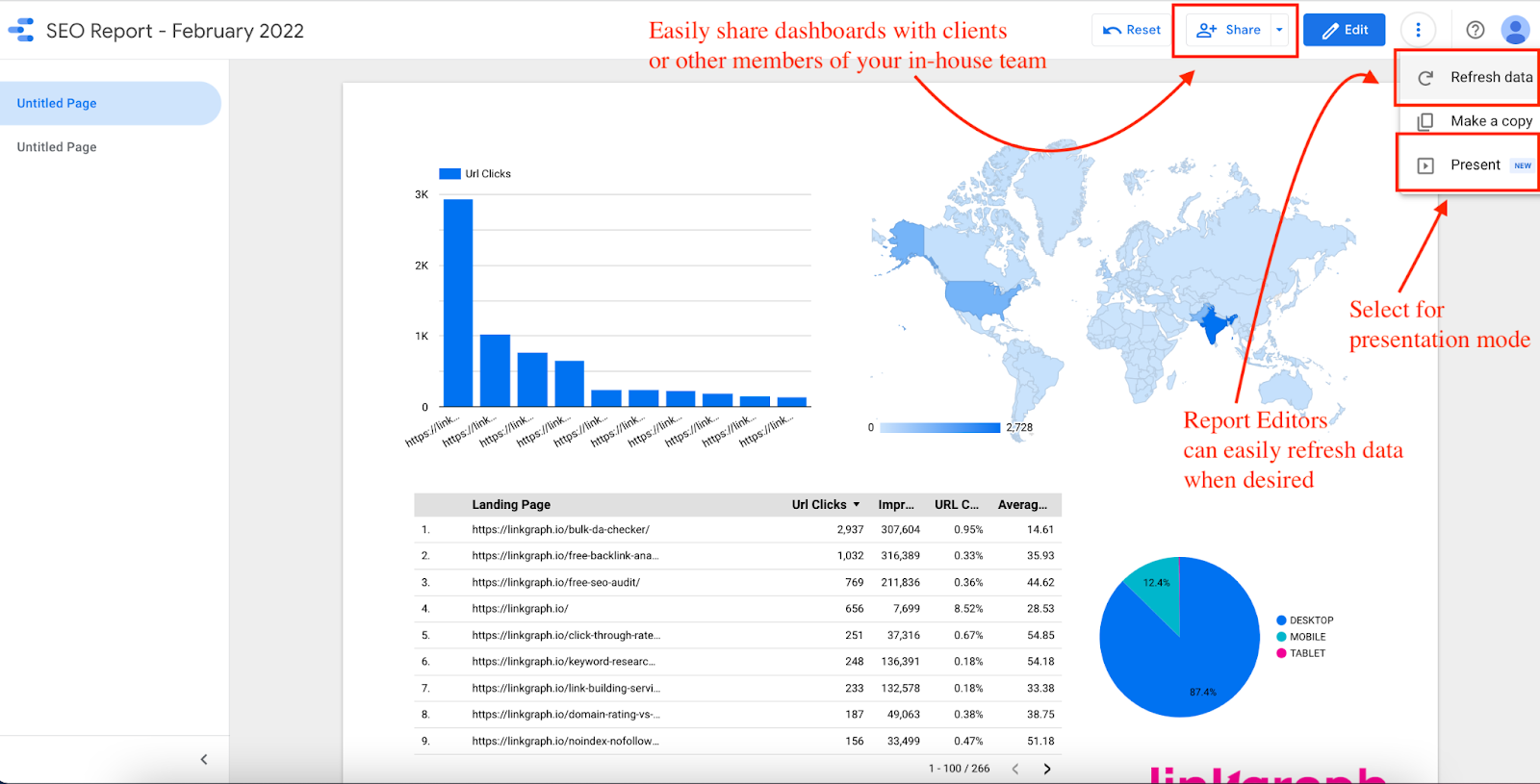
Share, Present, and Refresh Data
Google Data Studio also makes it easy to share and present your SEO dashboards with the most updated data possible.
This means SEO providers can easily create dashboards and update them on a monthly or quarterly basis without having to recreate new parameters, visualizations, and fields each time.
The sharing and presenting features also make it easy to give clients or other team members access to the dashboard.
Google Data Studio Templates
If you don’t have the time or desire to create your own reports or SEO dashboards, you can look to Google Data Studio templates to get ideas and models for effective ways to display and tell SEO stories with data.
You can purchase data templates and use them for your own dashboards within Google Data Studio. But remember, those templates may or may not help you tell the story that is most impactful and beneficial to your agency, business, or brand.
That’s why I strongly encourage SEOs to get comfortable with Google Data Studio so they can leverage data in ways that best help promote and grow their client base.
How to Increase ROI of SEO Efforts by 420% With a Marketing Analytics Platform
Let's have a heart-to-heart here. Have you ever wondered if there's a better way to do SEO reporting than spreadsheets or using a basic connector in Data Studio?
Picture this:
And even if you do everything right, you’re going to end up with a dashboard full of proxy metrics such as traffic, impressions, CTR, and others. They’re nice to have but don’t represent the impact of SEO efforts on the company’s bottom line. What you really need are the hard hitters, the metrics that talk dollars and cents - ROI, revenue generated from organic search, and more.
So, what's the solution?
A marketing analytics platform is an automated solution that changes the way teams do marketing analytics. These platforms paint a complete picture of your marketing efforts, pulling data from every channel and platform you use, from organic search to paid ads.
Take Improvado for example. This platform frees you from the shackles of data management. The platform comes with 500+ API integrations with all kinds of marketing data sources - just a few clicks and you've got all the metrics you need, right at your fingertips. You choose what you want to see, it does the heavy lifting.
Don't want to switch from the visualization tool of your choice? No problem. Improvado plays nice with all the major visualization tools. It offers ready-to-go dashboard templates for Data Studio and a bunch of others. You get to keep using your favorite tools, but with a serious performance boost.
And here's the real kicker - these platforms aren't just about SEO. They're about understanding the big picture of your marketing efforts. You'll see if your paid channels are outperforming your SEO efforts, how users are interacting with your content, and how many leads . In short, you get to see the whole movie, not just the snapshots.
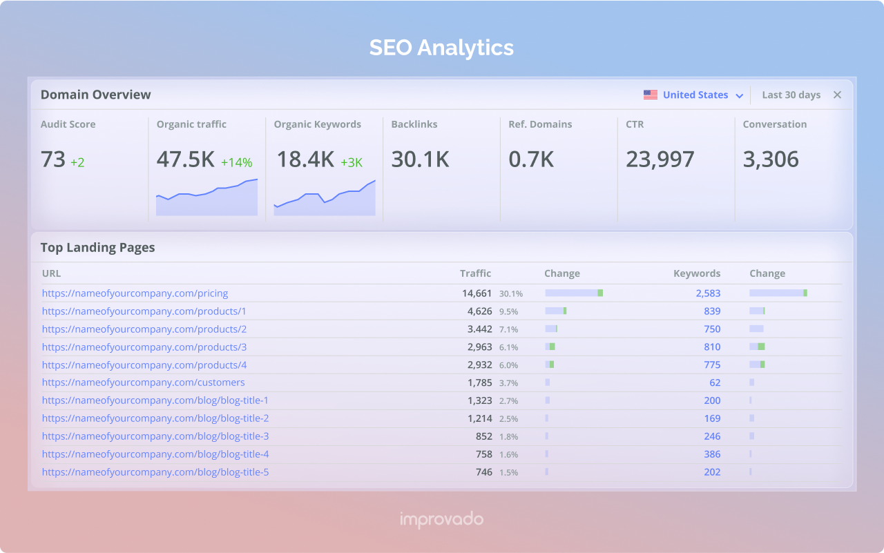
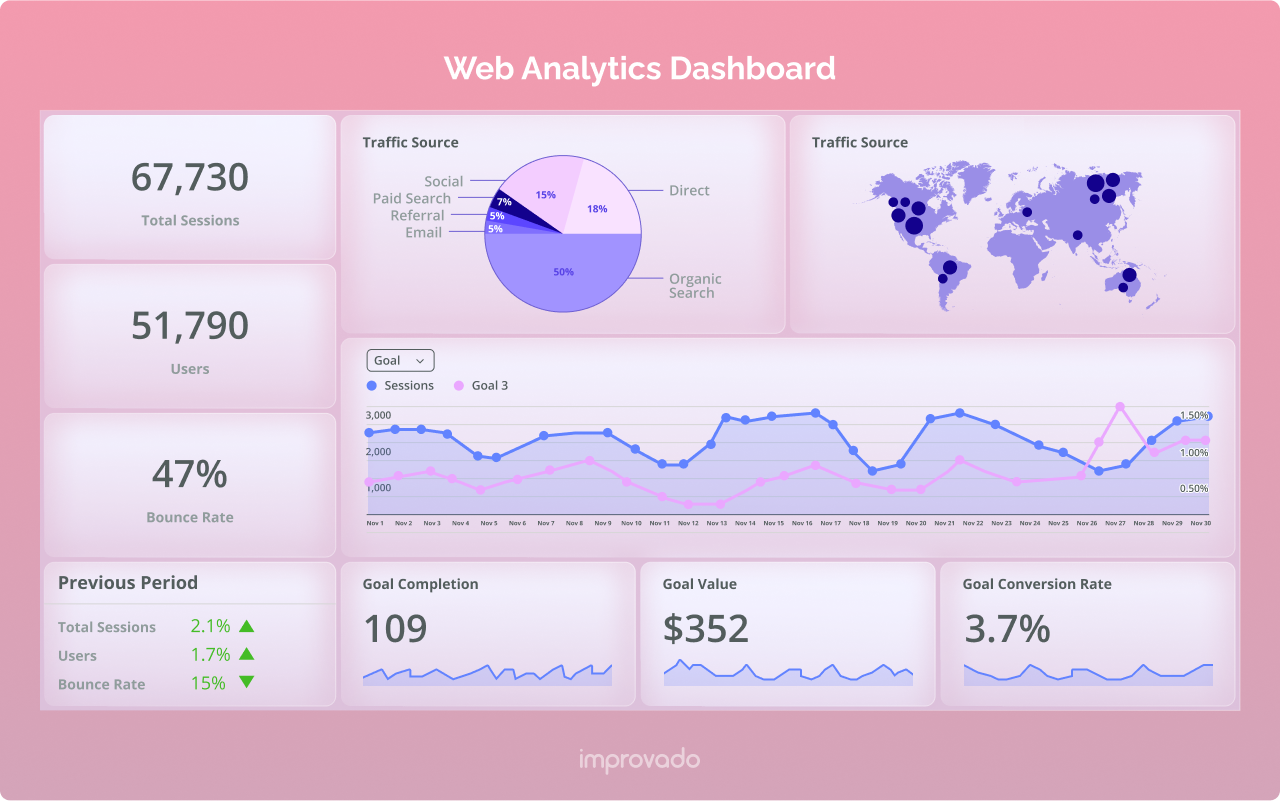
Here's the example of the SEO dashboard built with Improvado:
How to Set Up an Improvado-Powered SEO Dashboard
There’s no need to waste time learning programming and new marketing analytics tools when yours works perfectly fine—Improvado simply improves upon what’s already there.
Final Thoughts on Google Data Studio
Like all of Google’s free platforms, there is so much value to be had from becoming familiar with the available features and capabilities.
When using Google Data Studio, you can be confident that no other dataset for a site property will be as comprehensive or accurate. However, if you find that Google Data Studio’s interface or visualizations are not the best fit for your data storytelling needs, there are other rank tracking software tools that are built using Google’s API, meaning the same accurate, up-to-date data, but within a different interface and platform.
Whether you utilize Google data studio or other SEO data tracking tools, it’s never too late to start telling data stories in the way that most benefits your brand. The rewards are too good to pass up: Improved client acquisition, retention, and revenue growth.
Frequently Asked Questions
500+ data sources under one roof to drive business growth. 👇
Go beyond surface-level metrics with Improvado. Understand the true power behind traffic and keyword positions.
.png)
 (1).png)
.png)

.png)






 (1).png)

.png)


.png)


.png)
.png)
