34 Charts to Spot Revenue Growth Insights in a Single Dashboard
Today, revenue operations are more than just non-harmonized sales, marketing, and customer success activities. To achieve stable revenue growth, businesses have to synchronize these processes and create a universal method of tracking growth metrics. It’s now a lot easier to make decisions based on actionable insights from your dashboard because visualization makes dull figures from reports more straightforward.
Revenue growth dashboards gather all vital information about your business in one tab and visualize these insights to bring more visibility into the company’s revenue processes. With advanced marketing and sales graphs, analysts and upper management can make precise conclusions and accelerate the company’s growth.
In this article, we gathered 34 revenue charts that will help you build an all-in-one revenue dashboard and track revenue growth. Each of these charts contributes to a holistic picture of marketing and sales processes. Let’s roll.
Before diving into revenue charts and graphs, we need to discuss how to choose charts for your specific dashboards. The thing is, charts may vary depending on your business objectives, your business type, your overall strategy, and so on.
💡 The main goal of the revenue dashboard is to provide a real-time view of all revenue operations and their performance.
In plain words, each chart is a visual representation of a specific metric or set of metrics. By combining various metrics in a single dashboard, analysts achieve a granular view of revenue streams, marketing performance, conversion rates, and so on.
Choose Proper Visualization Methods
First things first, you have to pick the right visualization method for each metric. For example, if you’re dealing with time analysis, it’s better to use line charts. It’s much easier to catch a trend and perceive information with a single line. There are various chart variations:
- Bar charts
- Line charts
- Area charts
- Pie charts
- Scatter charts
- Column charts
- Combined charts
This guide explains in which cases analysts use different charts and provides tips on chart design.
A tip from our revenue team: Simplify. Try to minimize informational noise on your chart or dashboard. Use a simple line chart instead of creating tens of bars wherever possible. Remember, your dashboard should be clear for you and other stakeholders across the company. While presenting the dashboard to C-Suite, ensure the title corresponds to the main idea on the chart and that your chart is understandable to the utmost.
Set Goals for Your Report
Our next stop is the goal of the report. Each report should provide information based on initial requirements and avoid excessive and ineffective data. For example, high-level company reports should display information regarding company goals, such as revenue growth, scaling, customer retention rate, and so on.
When it comes to individual departments, reports become more narrowly focused. Marketing analysts usually track ROMI (return on marketing investment), CPL (cost per lead), attribution modeling, and effectiveness of marketing channels. As for sales analysts, they have to deal with CAC (customer acquisition cost), CLV (customer lifetime value), ACV (annual contractual value), and a range of other metrics.
A tip from our revenue team: Build specific charts. Whether presenting a new idea or reporting on achievements, don't try to fit all context into a single chart. Create a separate chart for each activity and craft a holistic dashboard of your revenue efforts. This is how you deliver information in a more digestible and rational way.
Automate Your Revenue Data Flow
A continuous data flow is essential for dashboards providing a 360-degree context about your revenue activities.
Analysts often aggregate marketing and sales data manually, which takes ages. That's why, when data reaches your dashboard, it might be already outdated. As a result, analysts have to refresh data repeatedly, spending their time on routine tasks instead of analyzing new data.
A revenue data platform will change your reporting workflow.
With the help of a revenue data platform like Improvado, analysts automatically extract data from 500+ marketing and sales sources to create an all-around view of their revenue efforts. The platform unites disparate data on a single dashboard to help teams reveal new trends and identify bottlenecks that limit revenue growth.
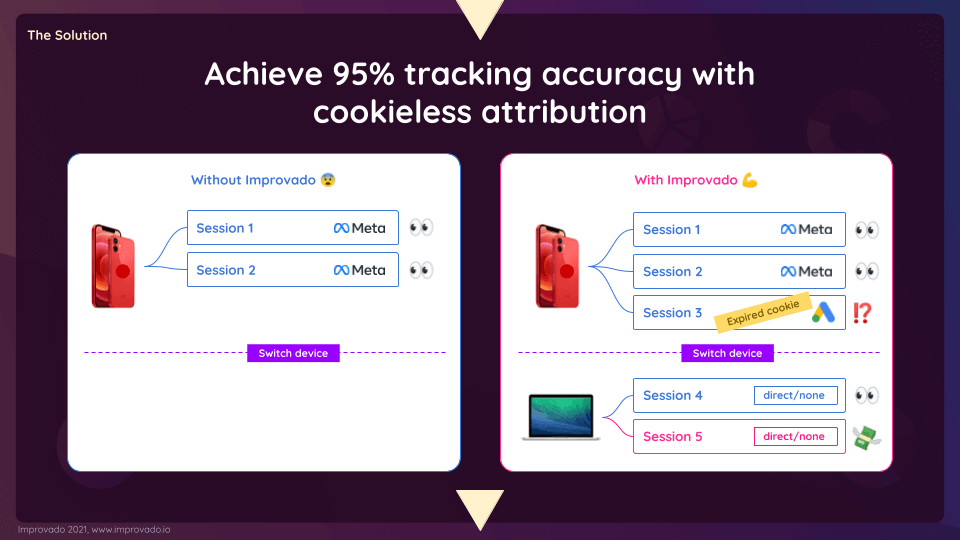
Furthermore, Improvado can identify which channels drive more leads and generate more revenue with cookieless attribution. Marketers no longer need to puzzle over the origin of their leads. The platform builds an end-to-end user path and displays it on a dashboard.
A tip from our revenue team: Automate your data workflow. Manual reporting takes a lot of time at the end of each reporting period. Marketers may spend weeks building a quarterly report on their activities. Data platforms, such as Improvado, accelerate manual reporting and eliminate the risk of human mistakes. Eventually, marketers get much more accurate data within minutes, not weeks.
How to Identify a Quality Revenue Chart for Your Dashboard?
Now, as we’ve got through all of the initial steps in building revenue charts, it’s time to figure out how to recognize an actionable and useful revenue chart. Here’s a list of “musts” for every insightful chart:
- The chart should answer your specific questions. An informative revenue chart should clearly depict all metrics you want to follow and provide upper management with up-to-date information.
- The chart should be clear and concise. Sometimes you might feel like adding some nice charts just to make your dashboard look better. Don’t overload your chart with useless information and excessive metrics. Make it as laconic as possible. In this way, the main indicators will be readable and it will be easier to analyze the dashboard.
- The chart should be well-designed. Pay attention to the chart’s design. Match the colors correctly, use a proper background color, and utilize sizes properly.
Right now, you already have an idea of what a useful chart should look like and what it should contain. So, it’s time to discover the most effective revenue charts and graphs that will help you track your business performance and skyrocket your company growth.
High-Level Revenue Charts
We’ll start with basic charts that will help for-profit companies keep an eye on their revenue indicators.
Total Revenue
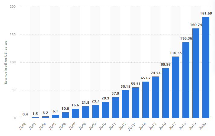
The total revenue chart depicts the total amount of income generated with all operational sales activities across all of the company’s products and services.
This chart shows the progression of revenue growth through the years. It lets you track the revenue growth tempo, identify time periods when revenue declined, and more. Depending on how frequently you gather data, this revenue chart may show monthly, quarterly, or yearly updates.
Year-over-Year Revenue Growth
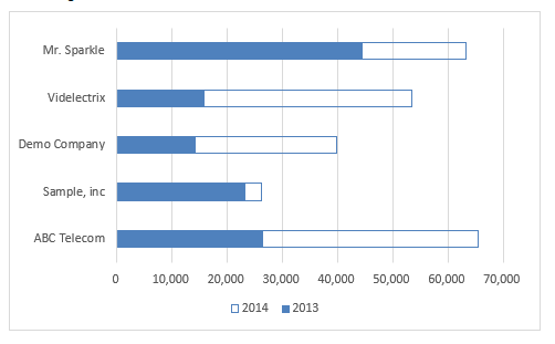
With a year-over-year revenue growth chart, analysts can compare the revenue generated by the company from year to year. Here’s a simple clustered bar chart that represents the YoY growth of different companies:
This chart allows analysts to focus on the growth achieved by different companies and identify the one that made the most profits in the current year.
Compound Annual Growth Rate
The next point on our list of essential revenue growth charts is the compound annual growth rate (CAGR). According to Investopedia, CAGR is the mean annual growth rate of an investment over a specified period of time that is longer than one year. Here’s a formula to calculate CAGR:
CAGR = (Future Value/Present Value)^(1/n)−1
Where ‘n’ stands for the number of years
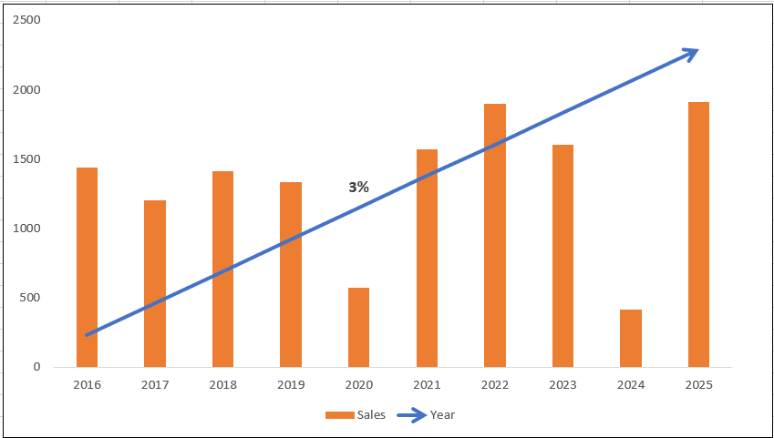
Here’s what a CAGR chart looks like:
The blue line represents the compound annual growth rate. Depending on the input data, the line can be ascending or descending.
Revenue by Product or Service
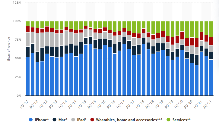
If your company distributes various products or services, it’s crucial to track which of them brings the most revenue. In this way, you’ll be able to identify all of the strengths and weaknesses of your offering, reallocate advertising efforts to less popular product modules, and adjust your product distribution strategy.
For example, here’s a revenue chart of Apple’s profit distribution by products and services:
Annual Recurring Revenue Chart
Annual recurring revenue (ARR) is the total amount of revenue generated by the company. Unlike total revenue, ARR tracks only the revenue generated by new subscriptions. That’s why this metric is crucial for SAAS businesses with a subscription-based monetization strategy. It helps analysts and upper management understand how much money the company can expect in a fiscal year.
Here’s the formula for ARR calculation:
ARR = (total value of a contract) / (the number of contract years)
Let’s assume that the client signs a contract for three years, and its total value is $30,000. The ARR for this particular contract will be $10,000.
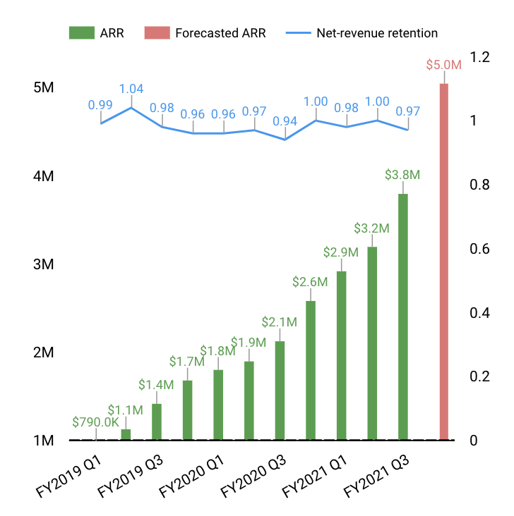
Here’s a revenue chart that can be used to identify potential growth with an ARR:
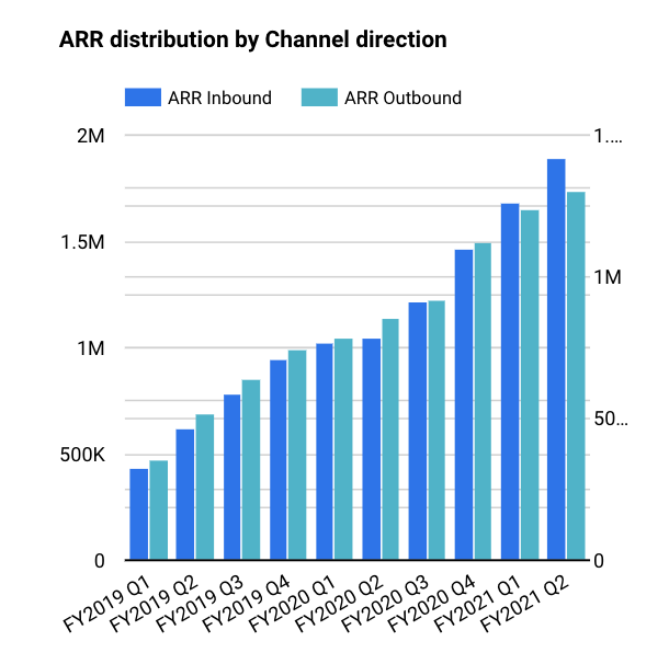
With the help of a column chart, you can also track the ARR distribution by different channels. Here’s an example:
Monthly recurring revenue chart
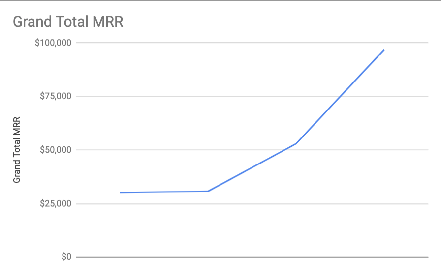
Monthly recurring revenue (MRR) is useful if you need to track revenue over a shorter period of time. Basically, it’s the same thing as ARR, but the sum of all subscription revenue is expressed as a monthly value.
This revenue chart example may be used to monitor total MRR for a particular period of time.
Monthly recurring revenue chart for SAAS products
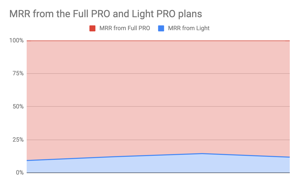
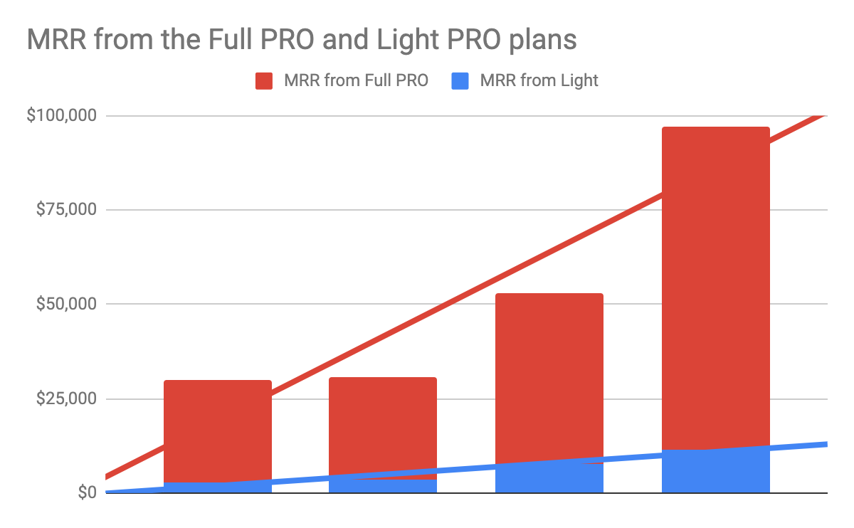
This chart shows two packages of software: Light and Full PRO, as well as the trend lines.
Here you can see a few examples of ways to represent this data: the 100% stacked area chart and the stacked column chart.
Both charts show that MRR from the Full PRO package is definitely higher. To figure out why this is the case, one needs to dive deeper into customer lifecycle metrics.
A column chart for different software packages:
Churn Rate
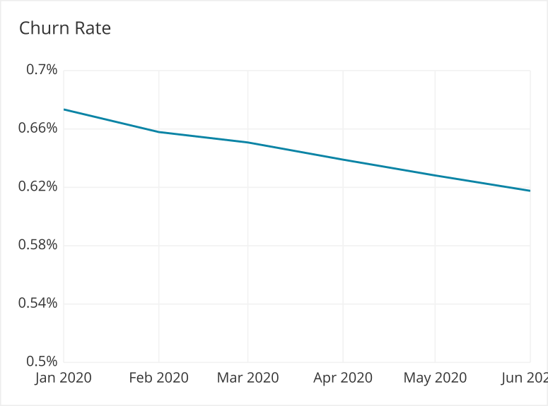
The churn rate represents the number of customers that canceled their subscription or didn’t renew the subscription in a particular period of time. The churn rate formula is pretty simple:
Churn rate = the number of churned clients / the total number of clients
As well as ARR, the churn rate is a critical metric for companies with a subscription-based revenue model. If the company’s product quality is low or they don’t provide an appropriate level of customer service, the business will probably lose customers. Eventually, if the business loses customers at the same speed as it gains them, the overall revenue growth will be equal to nothing.
With the help of line charts, you can show the churn rate over time.
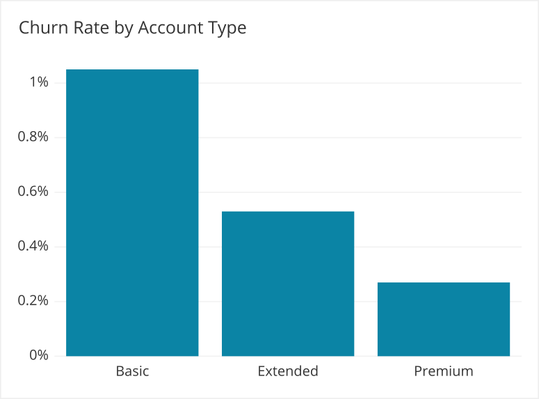
Bar charts can be used to show and compare churn rates of different product categories, account types, and so on.
Average Revenue per User
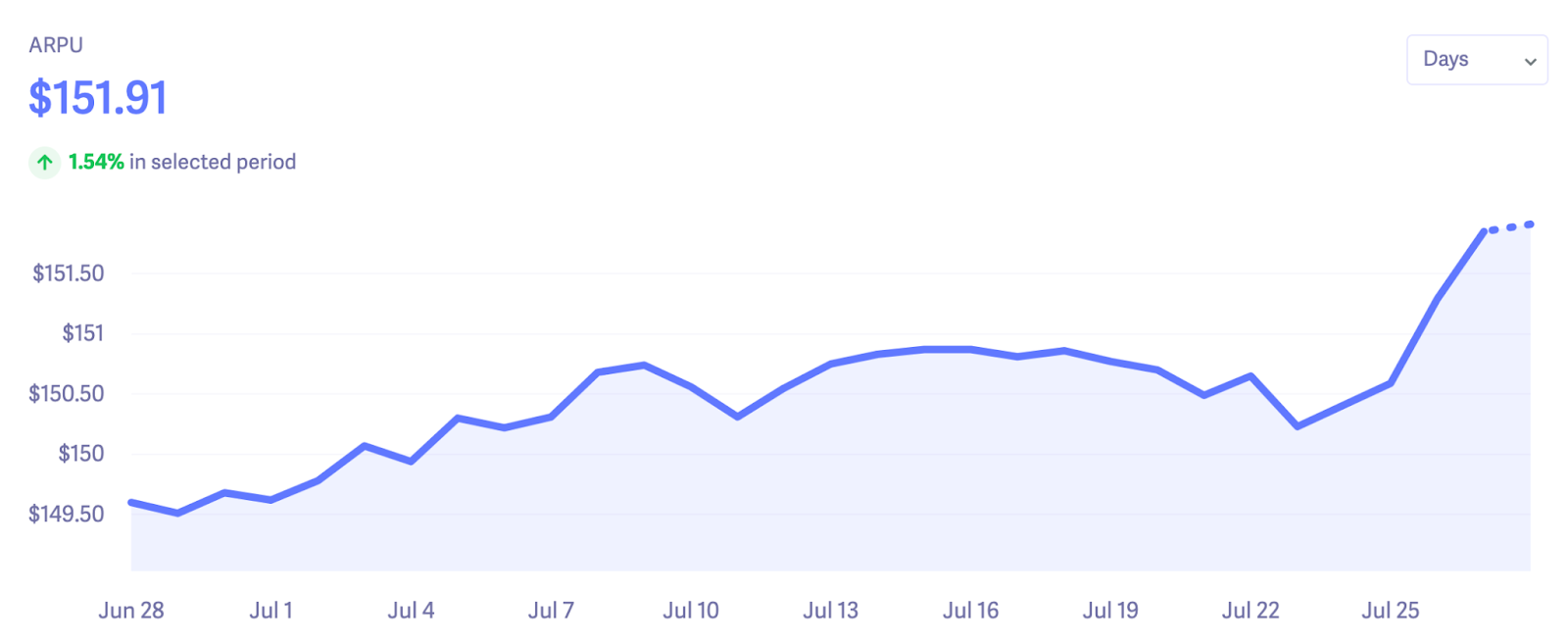
The average revenue per user (ARPU) is a metric that displays the amount of revenue generated by each user, account, or subscriber in a particular time frame. To estimate your ARPU, you have to divide the total amount of revenue for a specific period by the average number of subscribers during that period.
The higher your ARPU rate, the more value each user brings to your company.
This metric is useful to track because with a high ARPU, you don’t have to provide discounts to make customers sign a contract or buy a subscription.
Besides, identifying customers with the highest ARPU brings more clarity to what product modules are the most sustainable in terms of revenue generation.
Let’s assume you track ARPU for your product, which is a content marketing software. Your chart shows that a keyword research tool, which is a part of your product, has a significantly higher ARP than other parts of the software. This means that you can invest more in other parts of your product to increase their efficiency.
Here’s an example of the ARPU chart in action:
Market Share
The company’s market share shows the percentage of the market occupied by the company.
It helps you identify current industry leaders, determine the position of your company on the market, and analyze the possible product’s competitiveness.
As the market for your product expands, your company will grow its revenue, even with the same percentage of market share. If you grow your market share, the company will gain revenue even faster.
To calculate your company’s market share, you have to find out the total sales in your industry for a particular period. Then, divide the total company sales by the total sales in the industry to get an accurate market share rate.
Market share = (total company sales) / (total sales in the company’s industry)
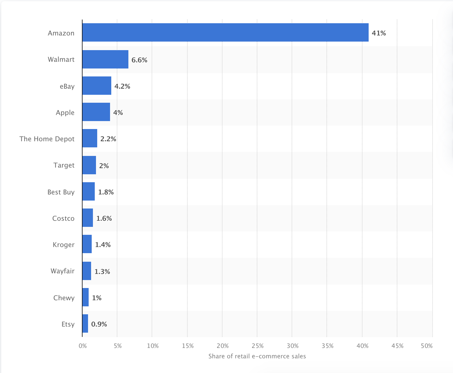
For example, here’s a bar chart showing the market share of leading ecommerce companies in the US:
Net Profit Margin
Average profit margin is an ultimate metric that every business should keep an eye on. It shows you how much net profit your company generates from total revenue after deducting all operating expenses, interest, and taxes.
This revenue growth metric demonstrates the overall success of your business; thus it’s extremely important to analysts and stakeholders.
Average profit margin is calculated by dividing your organization’s net revenue by net sales.
Average profit margin = net revenue / net sales
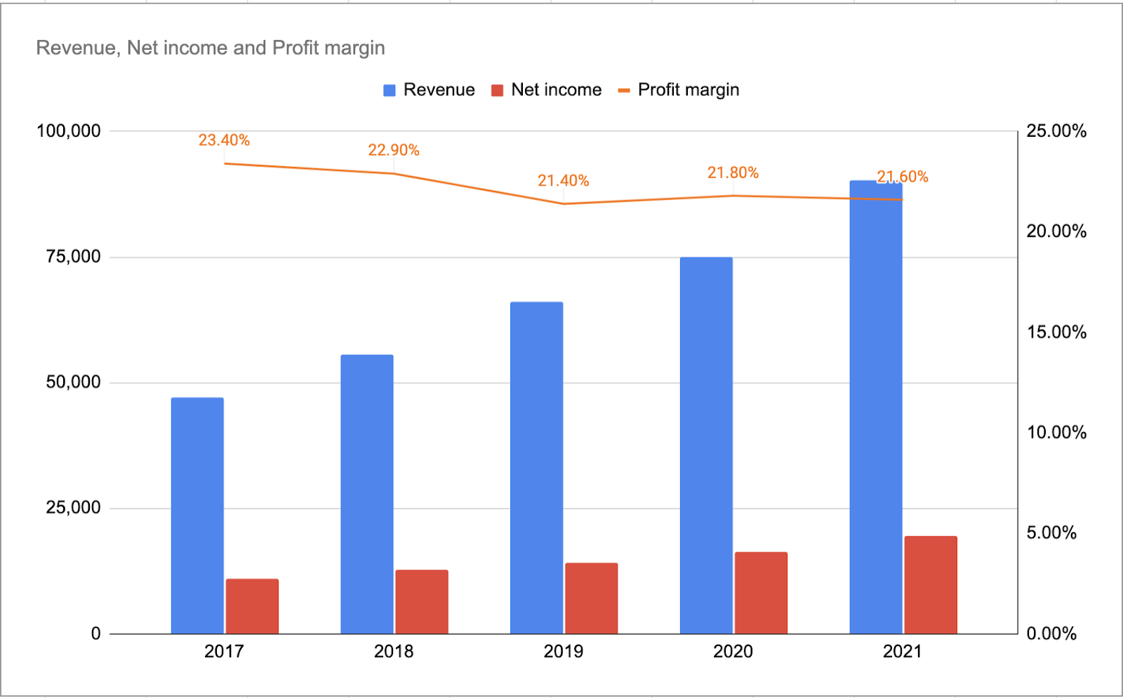
Here’s an example of a net profit margin graph. The line represents the profit margin, while the columns stand for revenue and net income.
These are all the basic charts that every business should track to identify revenue changes, keep track of industry trends, and find new growth opportunities. Right now, we’ll move on to more narrowly focused sales metrics and explore revenue charts that help to arrange sales processes inside the organization.
Revenue Charts for Sales Metrics
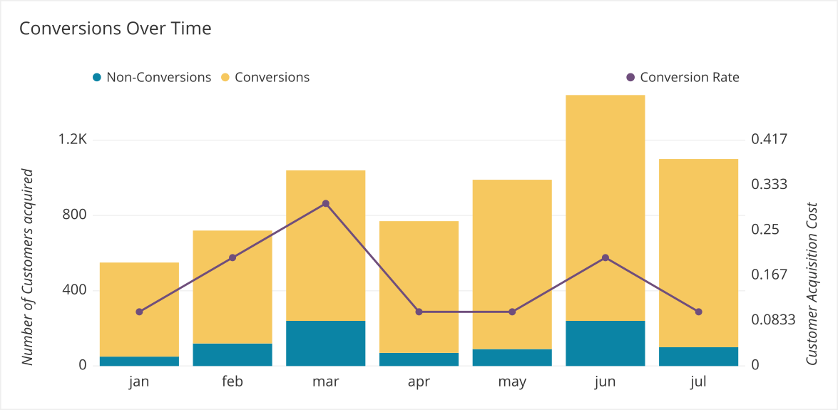
Conversion Rate
In sales processes, conversion rate is the number of sales-qualified leads that resulted in closed-won deals. Here’s the conversion rate formula:
Conversion rate = (the number of sales-converted leads) / (total qualified leads)
Monitoring conversion rate is essential because it helps to align marketing and sales processes. On the one hand, a low conversion rate with a high number of qualified leads may indicate that your sales team makes some mistakes during their communication with prospective customers.
On the other hand, monitoring the conversion rate and your leads’ characteristics over time builds a holistic portrait of your customer and helps you to sell your product only to relevant customers.
Besides, if the total number of leads increases but the conversion rate remains the same, it means that the company is promoting the product to the wrong audience. In this case, marketers have to change their positioning and messaging to drive new prospects and evaluate their willingness to buy. Sometimes, it might be an indicator for the product team to pivot and focus on different segments of customers.
Here’s a revenue chart that sheds more light on the conversion rate over time.
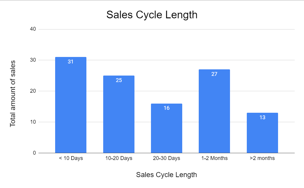
Sales Cycle Length
Another important sales metric to track is the length of the sales cycle. This indicator shows the time spent by the sales team to win the deal. Here’s a sales cycle length calculation formula:
Average sales cycle length = (total number of days) / (deals won)
Keeping an eye on this metric helps sales representatives identify bottlenecks in the sales process that may lead to delays and even potential deal losses. Additionally, sales analysts also track the length of time deals stay in the same stage to find out at what point deals may fail. This brings new opportunities for stimulating customers and accelerating the sales cycle.
Here’s a chart that shows the distribution of all company sales, depending on the sales cycle length.
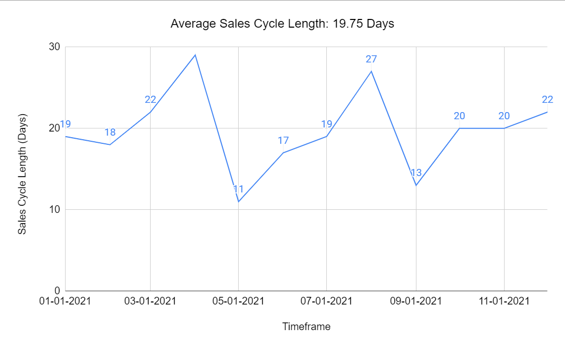
With the help of a similar revenue chart, you can track the average sales cycle length for a particular time period and see the sales cycle length for each month:
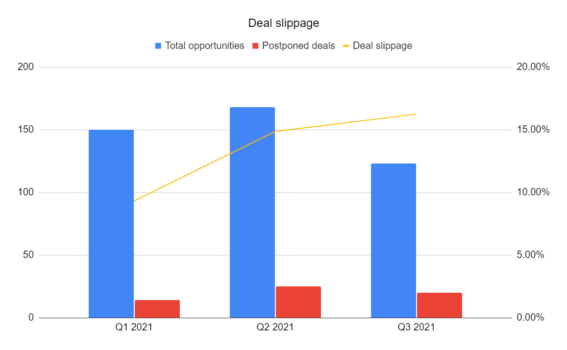
Deal Slippage
Deal slippage shows the number of deals that fail to close within the expected timeline in the sales forecast. It doesn’t mean that the deal is completely lost, however, because the customer may be still interested in the product but doesn’t have enough resources at the moment to purchase it. However, the deal gets pushed into the next quarter, year, or another timeframe, and the revenue for the current sales period drops.
Keeping deal slippage in mind while planning a new quarter will help you create more realistic estimates and set achievable goals. That’s why tracking this metric and being realistic are the main tools to fight this issue.
Here’s a formula to calculate the deal slippage rate:
Deal slippage = (the number of opportunities with a postponed close date) / (the total number of sales opportunities)
With the help of this revenue chart, you can track the number of postponed deals and the deal slippage rate itself:
Charts for SAAS Revenue Dashboards
Customer Acquisition Cost
Customer acquisition cost (CAC) is the total amount spent to bring a new customer, lead, or subscriber.
Every company strives to decrease CAC as much as possible, because the less they spend on bringing in customers, the more net revenue they get.
To improve CAC, companies use different acquisition and engagement techniques, such as:
- Explore new markets and adopt new channels
- Explain value to prospects in a different and sometimes unexpected way
- Reduce user activation barriers, i.e., provide free trials, refunds, and more
- Test new customer segments, such as gender, geo, interests, etc.
The cost of acquisition includes spending on all of the mentioned points. In fact, CAC might be a great indicator of how hard it is to arouse interest across prospects.
The formula for calculating the cost of acquisition is pretty simple:
Cost of acquisition = (amount spent on attracting new customers) / (the number of new customers attracted)
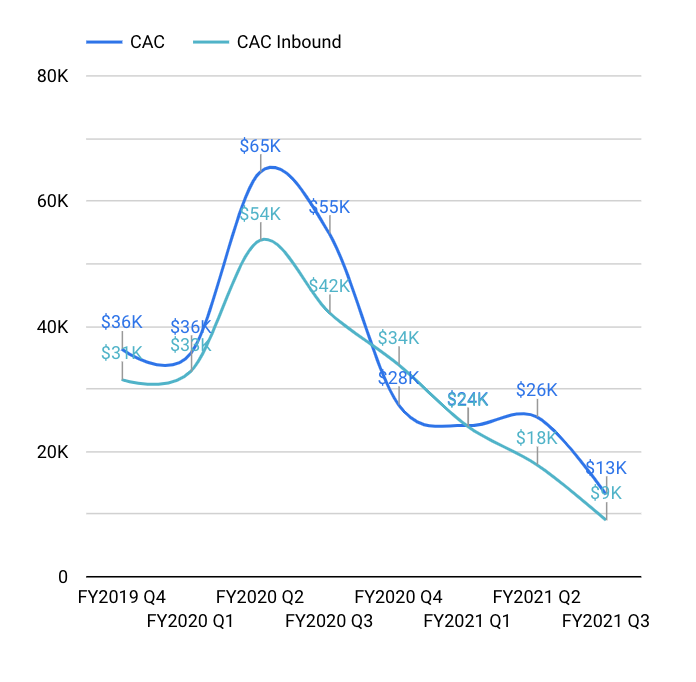
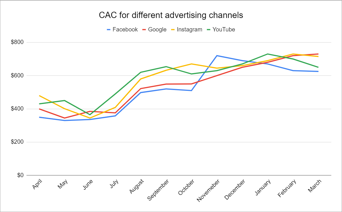
With the help of the CAC metric, you can track the cost of attracting new customers via different channels and compare which of them are the most effective.
For example, here’s a revenue chart comparing total CAC to CAC of inbound marketing:
With the help of line charts, you can better understand the changes in CAC across different channels and make more accurate predictions on the outcomes of campaigns.
Customer Lifetime Value
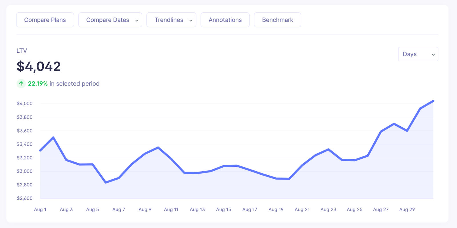
Customer lifetime value (CLV) is one of the key metrics to follow when building a revenue growth dashboard. In simple terms, CLV is a measure of how valuable a customer is to your company.
The metric measures the average revenue generated by the client during the entire partnership period with your organization.
Companies with a high CLV rate can invest more into customer attribution because they already have well-established client retention processes. That means customer attribution processes will have a higher ROI because each client will generate more revenue compared to companies with low customer lifetime value.
Here’s the formula for the customer lifetime value calculation:
Average customer lifetime value = (average number of transactions per month) * (average order value) * (average gross margin) * (average customer lifespan) / number of clients for the particular period
Here’s a simple line chart for visualizing CLV:
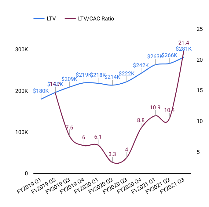
The LTV to CAC ratio is a crucial ratio to follow because it shows the ROI of your marketing expenses. A ratio of 3:1 is considered to be the ideal LTV to CAC ratio.
Of course, the higher your LTV, the better. However, if your ratio appears to be too high, it may indicate that you’re underspending on marketing efforts, thus limiting your company’s growth potential.
Here’s a revenue chart representing the LTV to CAC ratio:
Net Promoter Score
The net promoter score (NPS) is the most important metric in terms of customer satisfaction.
It measures how likely customers are to recommend your product to other prospects.
The NPS usually shows the level of satisfaction with your product and customer service. The most effective way to find your NPS is to ask clients directly.
Create a customer survey to learn what users think of your product. Net promoter score surveys use scales from 0 to 10, with 10 being extremely likely to recommend and 0 being absolutely unlikely to recommend.
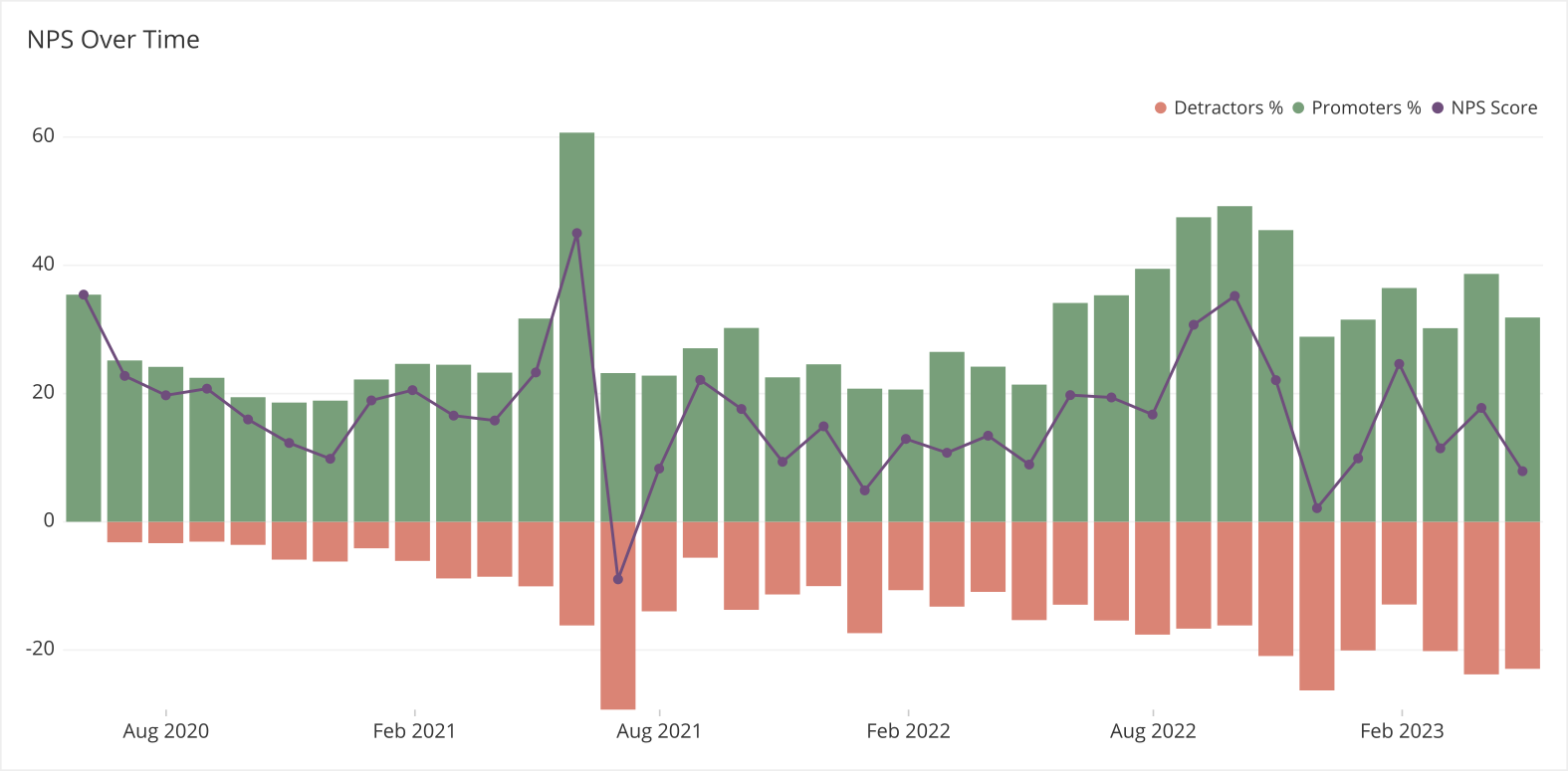
Later, having gathered the reviews, divide your clients in two groups. Those who graded the product from zero to six will be detractors, and those who graded from seven to ten will be promoters. Here’s the formula for calculating your NPS:
Net promoter score (NPS) = Promoters (%) - Detractors (%)
Stacked bar charts are a simple and effective way to visualize your net promoter score:
If you need something more actionable and sophisticated, you can use combined charts:
We’ve finished with sales metrics for an effective revenue chart. The last stop on our list is the marketing metrics that will help you get a granular view of your advertising performance and help launch campaigns that drive more customers to your business.
Revenue Charts for Marketing Metrics
Return on Advertising Spend
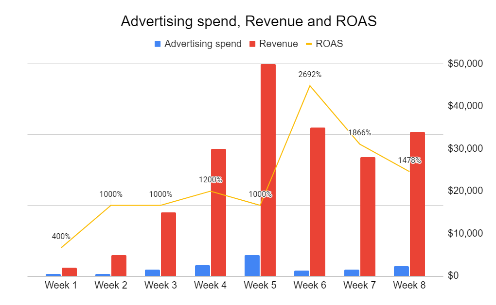
Return on advertising spend (ROAS) is the main metric that every marketer should follow. It measures the amount of revenue generated by investments in marketing campaigns. In addition to return on investment (ROI), ROAS measures the ROI of advertising spending.
Here’s a formula to calculate the ROAS of your marketing campaigns:
ROAS = (total revenue) / (advertising costs)
Apart from global ROAS, experienced marketers also track ROAS based on specific ads, campaigns, targeting, and so on.
Here’s a revenue chart you can use to track ROAS based on advertising spend and revenue:
Lead Distribution by Different Channels
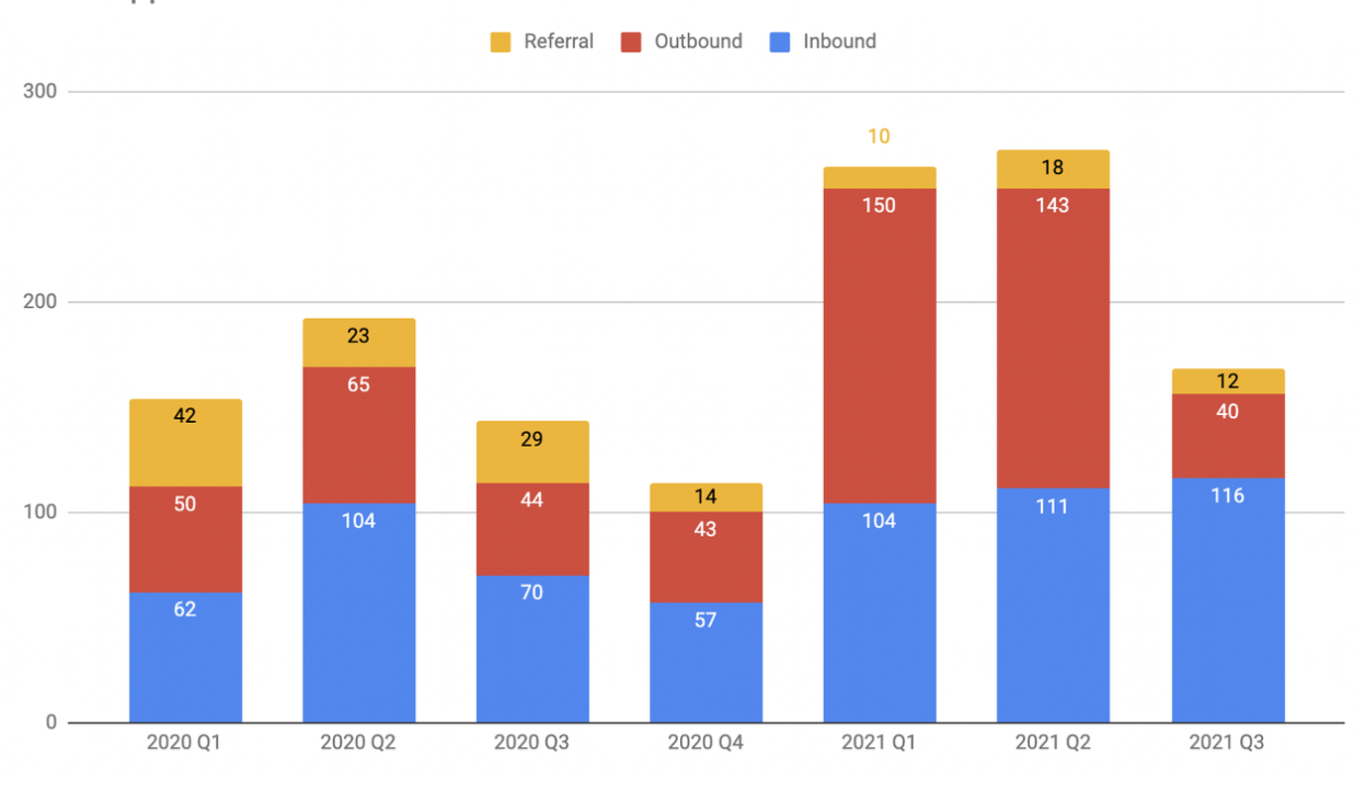
Knowing what channels bring you the most leads is crucial to finetune your campaigns and find the right channel to promote your product.
Here’s a column chart that will help you monitor lead flow from different channels:
Organic Traffic and SEO Charts
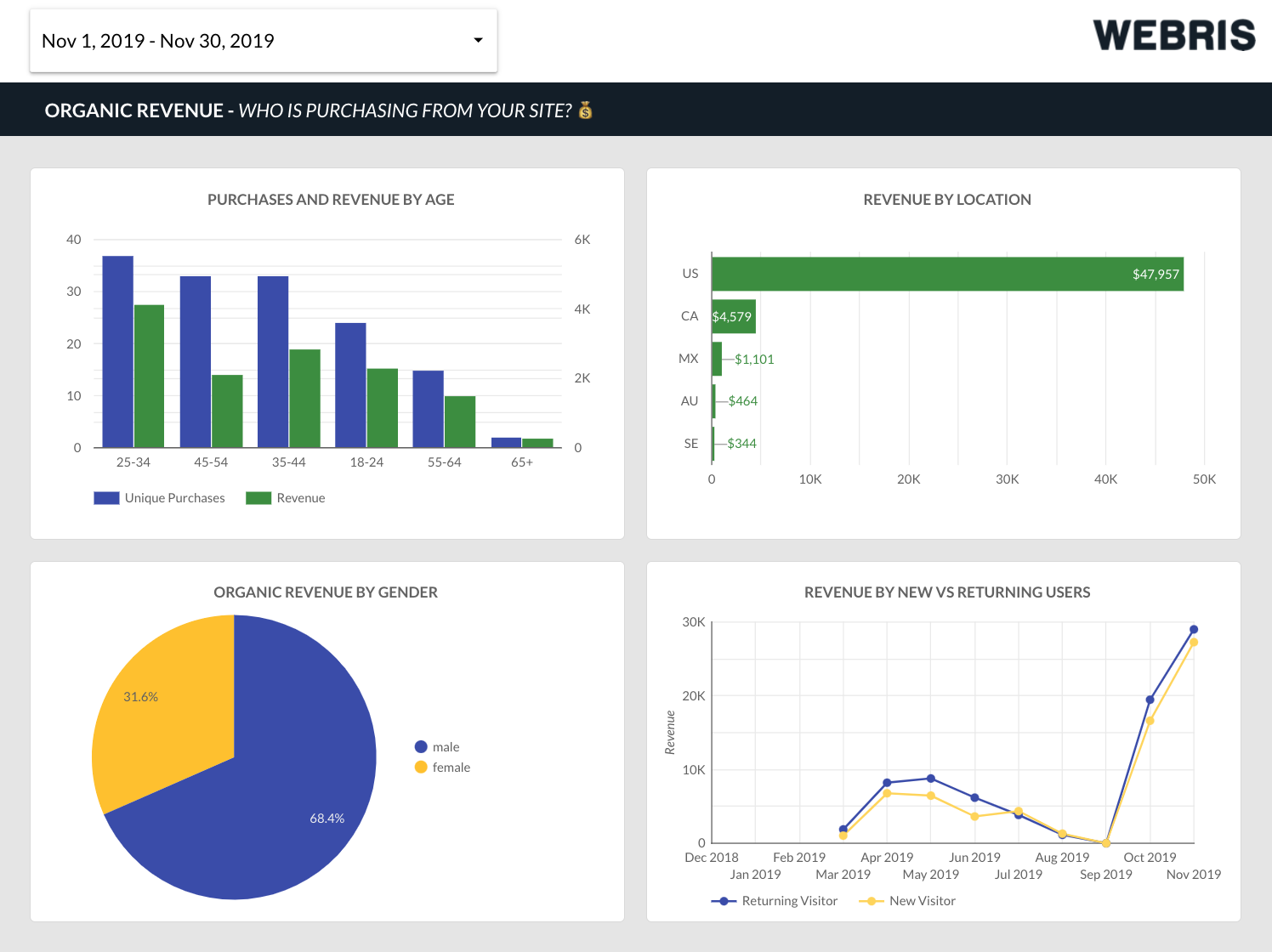
Attracting new customers from organic sources is a powerful and proven way to increase your revenue. However, it may be hard to define the quality of organic leads without breaking them down into groups and understanding their intentions.
This revenue dashboard example will help you get a holistic picture of the prospects coming from organic sources:
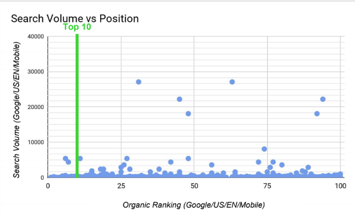
Besides, it’s vital to track the position of all the keywords you’re ranking for. Here’s a scatter plot revenue chart that will help you with it:
Paid Traffic Sources Charts
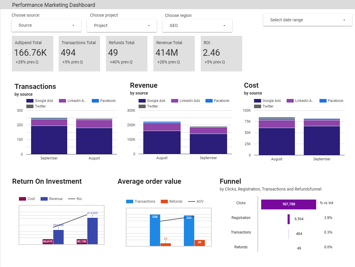
Most of Improvado’s B2C clients monitor detailed metrics from specific user acquisition channels in a revenue dashboard to easily identify the causes of specific growth.
Marketers who utilize paid traffic sources should understand the audience their ads are being shown to. Each impression or click costs money, and that’s why you want to make sure that you’re reaching out to the right prospects at the right time. Here are some revenue charts that will help you better understand the audience you’re interacting with.
Paid ad performance by platform
Analyzing your performance charts by platform will help you understand which OS/device has a better CTR, allowing you to optimize your budget around this data.
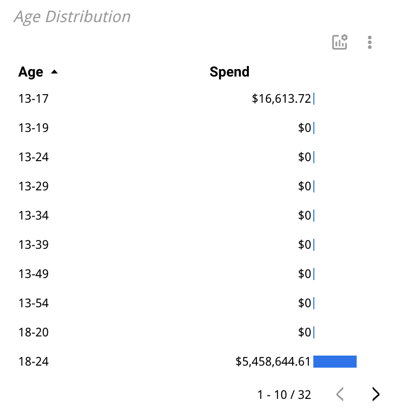
Advertising spend distribution by age
The age of your audience will determine how much of a budget you spend to reach them via numerous advertising platforms. These charts are fantastic since they combine data from all the platforms, not just one channel.
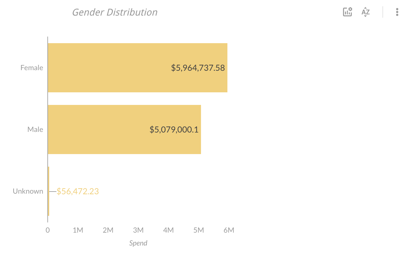
Advertising spend distribution by gender
The gender of your audience affects how much you spend to reach out to them. These sorts of charts will quickly reveal the costs across all of your marketing and sales channels.
Cost per engagement ratio
Your CPE ratio shows how much money you spend to make users engage with your content. The chart below shows the dependencies between the CPE and the engagement rate.
CPM revenue chart
The cost per mille chart is an indicator of how much you spend to generate 1,000 impressions of your advertising.
Magic Number Chart
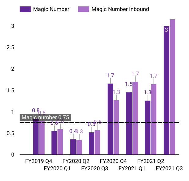
The Magic Number is a ratio generated based on every marketing and sales dollar spent. This metric shows the company’s efficiency level and the sustainability of marketing and sales processes.
Here’s the Magic Number formula:
Magic number = ((revenue in the current quarter - revenue in the previous quarter) x 4) ÷ sales and marketing spend in the previous quarter
If the Magic Number is equal to one, the company’s sales and marketing expenses are considered to be efficient.
If the Magic Number is less than one, it means your expenses aren’t efficient enough in generating revenue.
A number greater than one means that your investments are highly effective.
Here’s the chart to track your Magic Number over time:
Knowing what charts to use in different situations is an essential skill for anyone who wants to build an actionable revenue growth dashboard. But it’s equally important to know what revenue chart tools to use, as well as the benefits and drawbacks of each of them.
In this section, you’ll get a quick overview of the most relevant revenue chart tools for businesses of different sizes.
Revenue Chart Tools for Small Businesses
The main objective for small businesses is to create a foundation for future revenue growth tracking processes. Such organizations usually don’t run complex omnichannel marketing campaigns and gather small amounts of sales data. It makes no sense to waste money on enterprise-level revenue chart tools because upper management won’t be able to take every advantage of such software.
A well-known beginner-level visualization software is Google Sheets. This solution offers some evident benefits:
- Google Sheets is completely free
- It can be a decent revenue chart tool in the right hands
- It offers some automation capabilities and the majority of data aggregation tools support Google Spreadsheets
- The majority of analysts have hands-on experience with this tool
However, it isn’t the best software for handling large amounts of data. In the long run, when the organization starts to gather more information, Google Sheets may slow down analysis processes and waste analysts’ time.
If you’re looking for a more sophisticated and narrowly focused visualization tool, here are some of the best revenue chart tools for small businesses:
- DashThis (4.9 / 5 according to G2)
- Whatagraph (4.6 / 5 according to G2)
- Cyfe (4.5 / 5 according to G2)
- Grow.com (4.3 / 5 according to G2)
Besides, you may need an ETL tool to automate the data flow between several marketing data sources and gather insights in a data warehouse. Tools like Supermetrics or Funnel will be the best fit for this task.
Revenue Chart Tools for Medium-Size and Enterprise Businesses
Large companies require more functional tools with automation capabilities. Large amounts of data from sales CRMs and tens of marketing data sources should be normalized, well-arranged, and displayed in a single dashboard. That’s why data normalization and aggregation should be the top priorities for large organizations.
ETL tools, such as Improvado or Adverity, extract data from disparate sources, harmonize it, and push it to a dedicated data warehouse. These are enterprise-focused tools that offer useful automation features for large data sets. For example, Improvado’s MCDM handles automated data mapping and aligns marketing metrics’ naming conventions from different sources. These features save hundreds of hours on routine tasks and provide users with accurate, analysis-ready metrics.
Additionally, companies need reliable, secure, and efficient data storage. Some of the best solutions on the market are:
- Google Big Query
- Amazon S3
- Snowflake
Finally, from the warehouse, ETL tools can push your data right to the dashboard. So, the only thing left is to find a proper enterprise revenue chart tool for your business. Here are some of the best candidates:
- Google Data Studio (4.3 / 5 according to G2)
- Tableau (4.4 / 5 according to G2)
- Looker (4.4 / 5 according to G2)
- Power BI (4.4 / 5 according to G2))
With this set of tools, you can build detailed dashboards and keep your hand on the pulse of your revenue growth.
With all of these revenue charts, you’re ready to build an all-in-one dashboard for tracking your revenue growth. All that’s left is to pick the right tools and decide on the metrics you’re going to track.
Improvado can help you track your revenue growth by consolidating marketing and sales data from 500+ data sources. Improvado’s ETL solution automatically normalizes your data and aggregates all insights in a dedicated data warehouse. Due to our one-hour data synchronization frequency, your dashboards will always have fresh data. Schedule a call to learn how you can boost your revenue growth with Improvado.
500+ data sources under one roof to drive business growth. 👇
.png)
 (1).png)
.png)

.png)
.jpeg)









 (1).png)

.png)


.png)


.png)
.png)
