How to Use Data Visualization Tools for Your Marketing Reports
People are visual creatures by nature. We respond much better to visual cues like shape, color and form, whereas numbers and words are abstract notions that we have to acquire by learning. That’s why when it comes to data it’s much easier to identify patterns and trends through charts and dashboards, rather than reading tables full of data. Visualization tools like Tableau, Google Data Studio, Power BI and others can help transform your data into stunning charts and reports that can be easily used across your organization.
Visualization tools components
A data visualization tool consists of two main parts: the data source and the visualization. The data source can be a file such as a .csv or Excel file, or a connection through a server. Data visualization tools usually support integrations with most major analytics tools.
As soon as you have your data in the tool, you can start creating reports or dashboards. A report is a collection of charts and other elements, such as images and text. The types of visualizations that are available in most tools include tables, time series, bar charts, pie charts, geo maps, scatter plots and others. After you create your report you can upload it on a server so that it’s accessible online by people in your company.
How to connect your data to a visualization tool
Let’s take Google Data Studio as an example on how to import your data to a visualization tool, so you can start working with it.
As you can see in the picture below Google Data Studio, as expected, offers connectors with other Google tools like Google Analytics, Google Ads, Google Sheets and Google Ads Manager.
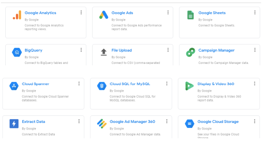
You can also upload a file but that means that your dashboards will not be updated automatically but you have to upload a new file every time you have new data.
So a connector with a tool or an SQL database is preferred, since a data pipeline will be created that will update the data automatically. You have options such as MySQL, PostgreSQL and Google BigQuery to import your data from a data warehouse.
In order to import data in that way you usually need to provide some info such as the Host Name or IP and your Database name.
You could also use an ETL tool with automatic integrations, such as Improvado, which helps you connect to Google Data Studio and other visualization tools hassle-free. This will really save you time, since you already should have all your marketing data connected to such an ETL tool.
Define your goals and audience before building dashboards
Your dashboards should be tools that help your marketing team make decisions. Think about what different stakeholders care about or what their day-to-day job is before you make a dashboard for them.
For example, a CMO would like to see the big picture, such as the overall marketing ROI and the performance of each channel in order to make decisions about budget allocation. A Performance Marketer, on the other hand, would probably need access to campaign and ad-level data with a lot more metrics, including click-through-rate, conversion rate, cost per 1000 impressions, so that they can optimize their campaigns and find out what is working.
When you define the needs of each team or stakeholder, try to translate them into metrics. For example, if a Paid Search Manager tells you that they’d like to see the performance of their PPC campaigns, think about what that means in terms of metrics. Probably, they should be able to see the click-through-rate and conversion rate of each keyword and campaign.
A good idea for all dashboards is to have a timeline for all the important metrics, as well as a comparison with the previous period, such as last month or last week, so that your team can have a benchmark on how their marketing activities are performing over time.
Steps to Becoming a Marketing Data Visualization Master
Before setting out to create a marketing data visualization, keep in mind that the hard work and truth are in the analysis. Many tools make it easy to produce attractive visualizations, but these are of no value if they gloss over the weakness of the underlying analysis. The properly selected visualization will not only convey that information, but it should stimulate additional questions.
There’s no single visualization that will best communicate insights, data, and analysis. Choosing the wrong form can leave your audience confused or misled. All the work you’ve done collecting and analyzing the data can be wasted if you don’t present it well.
Most marketers fall somewhere within the following 3 levels of mastery:
- Beginner at Visualizing Data - creating graphs and charts in Spreadsheets
- Intermediate at Visualizing Data - building Powerpoint deck presentations
- Master at Visualizing Data - using marketing data visualization tools
Beginner at Visualizing Data
First of all, we’ll start with the primary skills at marketing data visualization. We’ll consider basic reports and charts.
Many marketers manually collect and store all their data in spreadsheets like the ones demonstrated in this article.
Creating Graphs and Charts in Spreadsheets
Creating dashboards in spreadsheets is a great intermediate way for the marketing team to get a holistic picture of what is going on internally.
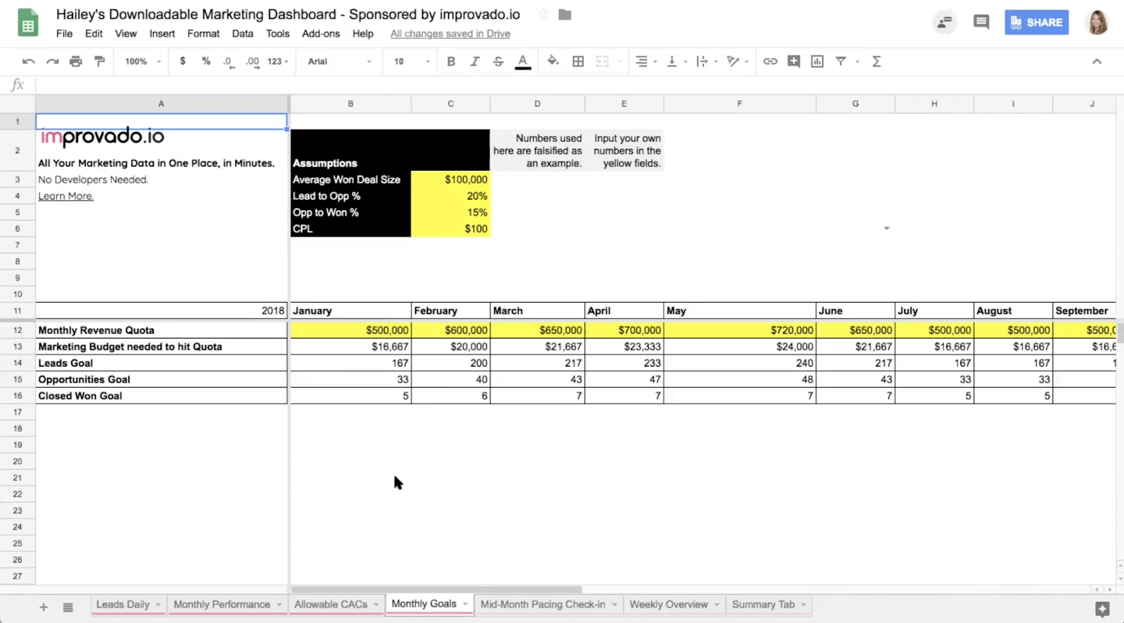
However, we can assure you — it’s not the type of dashboard you want to show to your CEO.
Their eyes will glaze over. It’s too many tables and numbers. It’s way too granular. You need to make the data tell a story visually so that people outside of your marketing team will be able to quickly understand it.
Most beginners at data visualization, begin to tell a story with their data by creating charts and graphs in Excel or a Google Spreadsheet. In our Marketing Dashboard Template, you can find some beginner-level visualizations in a Google Spreadsheet.
You’ll need to make pretty charts and graphs to help you visualize your marketing campaign performance for your CEO or leadership team.
For a high-impact presentation of a key metric such as sales, use single-value visualizations.
If you need to understand a mix of product, customer, channels, you want something that can show the percent of the total — probably a pie or donut chart. Additionally, for knowing where people are coming from geographically, you’ll want a map.
This is how you create visualizations manually. But if you want to automate your reporting and have a real-time marketing dashboard that any outside stakeholders can take a peek at, at any time, then that’s where Improvado can help.
Build your report around a goal
Although we can expect to gain focus and understanding as we go, we should know from the outset the goal of the campaign we’re putting in place. Are we looking to improve the effectiveness of a sales channel? Bump sales for a particular product or service? Drive new customers?
Knowing the goal gives us direction for our first round of data collection and visualization. To begin this process, we need to measure current results and compare them with future performance. For example, did we get the intended or increased number of new community members from the campaign?
Intermediate at Visualizing Data
Now, let’s discuss the intermediate level of marketing data visualization proficiency. We’ll emphasize Powerpoint deck presentations and storytelling.
Building Powerpoint Deck Presentations
Marketers that are at the Intermediate level when it comes to visualizing data, know that marketing the successes of their team is almost as important as marketing their product.
Like I mentioned in the section above, outside stakeholders will likely lose interest if you whip out your Excel dashboard to showcase performance at a leadership meeting. Charts and graphs will help, sure, but better to really craft a story around your data by putting those charts and graphs into a Powerpoint or Google Slides presentation.
That presentation deck can act as a digital marketing report that you’re going to share with outside stakeholders where you call out the big changes each month. The big key takeaways. Each headline should call out a key takeaway so that people can browse your presentation without even looking very closely at the graphs or charts.
Tell your story
At the end of the day, a well-made report should show the viewer the full picture of your efforts. Perhaps it’s only the story of your web traffic, but still, there should be a narrative. You want to sort things in order of importance and then group things by a general theme.
If only one person will use a metric, or the metric is not actionable, it probably doesn’t belong in your report.
Reports should offer transparency to how results were arrived at. A good report will be a portal into new questions and discovery based on established truth to inform future actions. But to get more advanced, you might want to level up to the Master level and use a visualization tool.
Master at Visualizing Data
Finally, we’ve reached the final stage of marketing data visualization proficiency. We’ll talk about marketing data visualization tools and different types of metrics.
Using a Visualization Tool for Real-time Dashboards
Most marketers at the Master level of visualizing data are using a marketing data visualization tool. This allows them to create real-time dashboards.
A dashboard is a collection of data-driven portals into different parts of your business, department, team, or individual work. They continuously measure performance (the most impactful with real-time data using a tool like Improvado to pipe your data into your visualization tools) and should offer an exploratory lens to ask new questions or observe actions. And the holy grail: being able to take instant action within that dashboard to impact future outcomes.
.png)
Dashboards can provide a supplement or an alternative to regular reports. Unlike a report, which is static and is provided at a regular interval — hourly, daily, weekly, quarterly — a marketing data visualization dashboard is always on and updated in real-time (or as close to it as we can get). Dashboards are a great way to access and share data. A powerful dashboard not only brings data into the conversation, it tells a story with that data.
For this guide, we reached out to our partners in data visualization over at Looker to describe what they’re seeing as best practices when it comes to building marketing reports and dashboards.
One of the first things they told us was that a marketer at the Master level of visualizing data understands the difference between Vanity metrics & Clarity metrics.
Vanity metrics vs. Clarity metrics
Vanity metrics are surface-level metrics. They’re often large measures that sound impressive to others. Examples might include the number of impressions an ad has achieved or the number of times an app has been downloaded. It sounds great if these numbers are high, but where is the business value? The value of an ad lies in how the people who have seen it respond, not how many people have seen it. Likewise, what’s important with an app is whether people are actually using it, not whether they downloaded it.
Clarity metrics are operational metrics, like the number of minutes per day the product actually gets used or how long it takes for a user to get service. Clarity metrics speak directly to business value. They enable predictions. They show how to move the business forward.
A great way to avoid vanity metrics is to focus on customer behavior and on the stream of events that make up the customer journey. If we unify the many puzzle pieces of customer behavior before and after the conversion in a single location, we can more easily enable the analysis to construct a clear view and insights into their customer journey. Event streams show how people move through your product and make it easy to analyze their behavior.
Another key indicator of a marketer at the Master level of visualizing data was the utilization of the two more advanced forms of marketing analysis, funnel and cohort analysis.
How to build a dashboard with a visualization tool
After you connect your data to the visualization tool, it’s time to start building your dashboards. The first thing you need to do is select a data source from the ones you’ve already linked via a connector, a file or a data pipeline.
We’ll take Google Data Studio as an example on how to create a dashboard. You’ve probably outlined the charts you’d like to include based on the discussions you had with your marketing team. A good idea is to also sketch your dashboard on a piece of paper before actually creating it to get a feel of what it would look like.
Start by selecting the chart you’d like, e.g. a timeline with your daily revenue. This is probably important for your team and company to monitor on a daily basis to keep track of sales. Make sure to select the appropriate metrics and dimensions for the chart, in this case Date and Revenue.
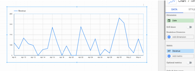
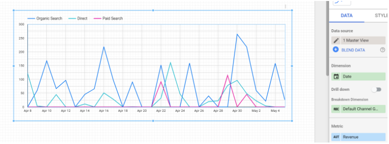
If you want more granularity you can add an extra dimension to break down the chart, let’s say, by channel, to see how much revenue each marketing channel contributes to the overall result.
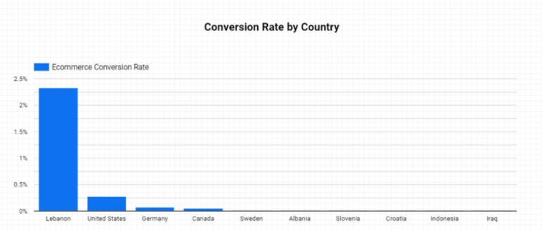
Move on by adding more charts that provide useful information to your team. In the example below, I’ve added a bar chart that shows the Conversion Rate by Country. This would be useful for your team if they want to evaluate the individual performance of each country they operate in. If a country is too costly and has really low volume, you might want to reevaluate your strategy for that market. On the other hand, if a specific market has a very good conversion rate it probably pays off to scale your efforts there.
Note that I’ve also added a title above the chart. It’s a good practice to add clear, explanatory titles for each chart so that it’s easy to understand even for someone seeing the dashboard for the first time. You’ve seen these charts thousands of times, so you might not find that important, but try to think like the average employee of your company who might use this dashboard only a handful of times. A title and even some documentation will go a long way to help anyone in the company use this dashboard.
Moreover, don’t forget to add selectors and filters to make the dashboard easy to break down or select specific views. The dashboard users will often want to focus on a specific date range or just a handful of values, e.g. just one market or a marketing channel. Make their lives easier by providing all the necessary filters.

Finish your dashboard by styling it in a consistent way so it’s easy to read. You might consider using the color scheme of your company to keep it in brand.
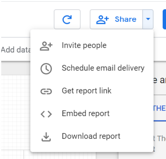
Don’t forget to share the dashboard with the rest of the company. Usually, you can generate a link on a server that you can share with the users that you choose. For example, Google Data Studio gives you the options seen in the image below.
Our recommendation:
Check out The Best Marketing Analytics Tools & Software for 2023
Best Data Visualization Tools: Tableau vs Looker vs Power BI [2023]
Learn about Best Dashboard Software
500+ data sources under one roof to drive business growth. 👇
.png)
 (1).png)
.png)

.png)


 (1).png)

.png)


.png)


.png)
.png)
